Scoring genre clarity...

Glassy Stare capsule

Glassy Stare

A story-driven psychological experience where memory fades, silence deepens, and something waits in the dark.

Free to PlayVery Positive(89)
Visual NovelSurreal2D
ghost funeralJan 23, 2026

Glassy Stare scores 65/100 — better than 20% of Visual Novel capsules (n=1,147).

Very Positive (89 reviews) · Free to Play · Released Jan 23, 2026 · By ghost funeral

Quick text summary

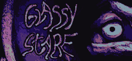
Glassy Stare scored 65/100 on Steam Analyzer — Solid for a Visual Novel capsule. Top priority fix: [title_readability] Increase letter spacing and use a cleaner, slightly bolder font variant that maintains the distressed aesthetic but remains legible at 120x45 pixel width.

Capsule scores by dimension

  • Genre Clarity: 7/10 — Psychological horror intent clear. The pixelated eye with unsettling pupil, purple-pink color palette, and glitchy aesthetic strongly suggest psychological horror or creepy indie experience. At tiny size the eye remains the dominant signal and reads as unsettling rather than action or adventure. Genre is recognizable but the exact gameplay loop (narrative vs. interactive vs. puzzle) remains ambiguous from visuals alone.
  • Title Readability: 5/10 — Title loses legibility at tiny. The decorative pixelated font for 'GLASSY STARE' is readable at full header size but deteriorates significantly at small and tiny sizes where letterforms blur and individual characters become difficult to parse. The outlined, somewhat distressed style adds character but sacrifices clarity at scrolling speeds. This is a classic case where artistic choice conflicts with functional discoverability.
  • Contrast & Color: 7/10 — Strong value separation works. The bright purple-pink eye with white highlight and the magenta title text create solid contrast against the dark purple-blue background, maintaining legibility even when squinting. The eye silhouette remains sharp and distinct in grayscale, and the warm pink tones pop well at small sizes. However, the background texture is not entirely empty, which slightly reduces the cleanest possible separation.
  • Uniqueness & Polish: 7/10 — Distinctive horror aesthetic present. The pixelated, corrupted eye treatment feels intentional and cohesive with the psychological horror theme, avoiding generic game imagery. The color palette and glitch-like title font suggest craft and deliberate artistic direction rather than asset placeholder vibes. However, the design does not communicate a unique mechanic or selling point beyond 'it is creepy'—it reads as mood rather than gameplay promise.
  • Brand Consistency: 6/10 — Consistent dark tone, limited icons. The purple-pink eye and distressed pixelated text are coherent in tone and fit a psychological horror identity. However, without reference to the five store screenshots or additional capsule variants, the visual language lacks an iconic character, symbol, or signature motif that would stand out as immediately recognizable across Steam browsing. The aesthetic is thematic but not yet a branded mark.
  • Composition: 7/10 — Clear focal point, well-balanced. The eye is positioned as the dominant focal point slightly off-center right, drawing immediate attention while the title text anchors the left side, creating natural visual hierarchy. At small and tiny sizes the eye remains the clear primary subject. Depth layering is minimal but functional; the close-up eye crop creates intimacy appropriate for psychological horror, though it relies heavily on one element.

What works

  • Strong color contrast against Steam background. Bright purple-pink tones and white eye highlight separate cleanly from the dark #1b2838 background, maintaining visibility at small sizes.
  • Cohesive psychological horror tone. The distressed pixelated eye, color palette, and glitch-like typography all reinforce the mood without mixed messaging.
  • Clear focal point hierarchy. The eye immediately draws attention at all sizes while the title supports without competing for focus.

What hurts the capsule

  • Title font loses detail at tiny size. The decorative pixelated letterforms blur together at scrolling speeds, making individual characters hard to parse at 120x45.
  • Limited gameplay communication. The visuals convey mood and genre but do not hint at core mechanics, pace, or what the player actually does.
  • No iconic brand symbol yet. The eye is thematic but generic to horror; it does not offer a distinctive visual marker that could anchor future marketing.

Priority fixes

  1. [title_readability] Increase letter spacing and use a cleaner, slightly bolder font variant that maintains the distressed aesthetic but remains legible at 120x45 pixel width.
  2. [genre_clarity] Add a subtle UI or environment hint (e.g., faint text overlay, object silhouette, or visual artifact) that implies narrative or memory mechanic without breaking the mood.
  3. [uniqueness_polish] Develop a signature visual motif or icon (beyond the generic eye) that reinforces the 'memory fades' core theme and becomes recognizable across capsule variants.

Store copy priority fixes

  1. [feature_communication] Move the opening sentence of the short description (or a variant) to the beginning of the detailed description to establish game type immediately, then follow with the atmospheric passage to maintain mood while answering 'what is this?' faster.
  2. [uniqueness] Add a sentence after the feature list that articulates a specific differentiator—e.g., 'Part of an interconnected anthology exploring psychological collapse,' or highlight what makes the visual style or narrative structure distinctly unforgettable.
  3. [genre_clarity] Clarify the nature of choices and interactivity in the bullet list—e.g., 'Narrative choices that shape perception and ending' or 'Interactive reading with branching interpretations,' to make gameplay loop more explicit.

Related guides

Steam app ID: 3869430 · Tags: Visual Novel, Surreal, 2D, Psychedelic, Dark