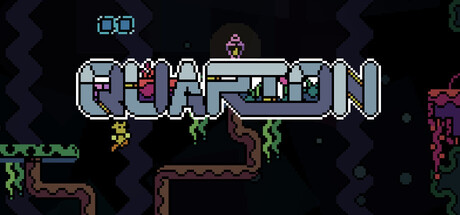
Quarion scores 75/100 — better than 71% of Metroidvania capsules (n=361).

Quick text summary

Quarion scored 75/100 on Steam Analyzer — Good for a Metroidvania capsule. Top priority fix: [title_readability] Increase title letter spacing or use a bolder pixel font variant to ensure crisp legibility at tiny thumbnail size without requiring focus

Capsule scores by dimension

  • Genre Clarity: 8/10 — Pixel metroidvania identity clear. The retro pixel art style, platforming architecture with multiple levels, enemy silhouettes, and central character pose immediately signal a 2D exploration game. At tiny size, the stacked terrain, scattered enemies, and small protagonist remain visually distinct enough to communicate the metroidvania subgenre clearly. The pixelated aesthetic and level design layout are strong genre cues that survive scaling.
  • Title Readability: 7/10 — Title readable but stylized. The QUARION title uses a distinctive pixel-block font positioned in the center-upper area with clean cyan and white coloring that contrasts well against the dark background. At small size it remains legible, though the decorative pixel letterforms become slightly compressed. At tiny size the characters are still distinguishable but require careful attention, putting it just above the confident range.
  • Contrast & Color: 8/10 — Strong separation against dark background. The bright cyan title, light blue platform structure, and pixel-bright enemy sprites create excellent value separation against the #1b2838 dark background. The grayscale test shows clear silhouette definition for all major elements including the protagonist, terrain, and enemies. Key foreground elements pop cleanly without muddy mid-tones or blending.
  • Uniqueness & Polish: 7/10 — Polished retro aesthetic, somewhat familiar. The capsule demonstrates clean pixel art execution and intentional visual hierarchy with the title framing and balanced enemy/platform placement. The retro aesthetic is well-crafted and cohesive, but the pixel metroidvania style is becoming increasingly common in indie releases, limiting the distinctiveness premium. Still, the execution quality and clear visual storytelling about exploration and combat set it apart from generic platformers.
  • Brand Consistency: 7/10 — Consistent pixel style, recognizable motifs. The capsule maintains uniform pixel grid resolution, color palette (cyan, white, brown, pink enemy), and art direction throughout. The central protagonist silhouette and enemy design are consistent with classic metroidvania visuals that could support brand recognition across marketing materials. No jarring style breaks or tonal inconsistencies within the frame.
  • Composition: 8/10 — Clear hierarchy, balanced focal point. The title anchors the top portion with the game scene layered beneath, creating clear depth and hierarchy. The protagonist at center-right serves as the primary focal point with enemies and platforms creating supporting visual interest without competing for attention. At small and tiny sizes, the composition remains readable with no critical elements cut off by safe margins, though the scattered enemies are abstract enough to maintain clarity.

What works

  • Immediate genre recognition. The pixel art platformer setting with multiple terrain layers and enemy placement instantly communicates metroidvania gameplay expectations.
  • Excellent dark background contrast. Bright cyan title and light platform elements create strong value separation that survives the tiny size test without loss of clarity.
  • Cohesive visual style. Uniform pixel resolution and consistent color palette across all elements builds recognizable brand identity and craft quality.

What hurts the capsule

  • Title compression at tiny size. While readable, the decorative pixel font becomes slightly cramped and requires squinting effort to fully parse at thumbnail scale.
  • Limited visual uniqueness. The retro pixel metroidvania aesthetic, while well-executed, does not stand out distinctly from other indie titles in the same subgenre.
  • Scattered secondary elements. Multiple enemies and visual details, while not cluttered, create minor focal point competition that slightly weakens the primary subject emphasis.

Priority fixes

  1. [title_readability] Increase title letter spacing or use a bolder pixel font variant to ensure crisp legibility at tiny thumbnail size without requiring focus
  2. [uniqueness_polish] Add a distinctive visual hook such as a signature color accent, unique UI element, or memorable character pose that differentiates from standard retro metroidvanias
  3. [composition] Consider increasing the protagonist silhouette size or contrast slightly to strengthen the primary focal point and reduce secondary element competition

Store copy priority fixes

  1. [hook_strength] Rewrite the short description opening to lead with the crashland scenario and a specific consequence: 'Stranded on an alien planet, unlock abilities and survive brutal bosses to escape' rather than starting with genre terminology.
  2. [uniqueness] Add a specific claim about what differentiates Quarion: reference a particular ability type, world feature, or design philosophy that sets it apart from other metroidvanias mentioned.
  3. [feature_communication] Expand the detailed description with concrete details: estimated playtime, number/types of bosses, whether abilities are gated or optional, and what 'secrets' reward players with to build a clearer mental model of gameplay.
  4. [tone_match] Inject personality into the copy that matches the retro inspirations—use more evocative language than 'tough foes' and 'come to expect' to create voice consistent with indie platformer expectations.

Related guides

Steam app ID: 3870310 · Tags: Metroidvania, Adventure, Exploration, Nonlinear, Singleplayer