Elemental Adventure scores 70/100 — better than 28% of 2D Platformer capsules (n=1,970).

Quick text summary

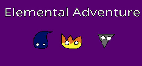
Elemental Adventure scored 70/100 on Steam Analyzer — Good for a 2D Platformer capsule. Top priority fix: [genre_clarity] Introduce visual conflict or action cue—position one character off-balance or add a directional element that suggests the rescue mission narrative

Capsule scores by dimension

  • Genre Clarity: 7/10 — Clear adventure with character focus. The three character icons with distinct elemental personalities (water droplet, fire cat, tech triangle) immediately signal a narrative adventure with character-driven gameplay. At TINY size, the silhouettes remain readable and the cute art style suggests indie adventure rather than action-heavy gameplay. The purple gradient background and icon arrangement feel intentional for a colorful indie title.
  • Title Readability: 8/10 — Clean sans-serif, excellent contrast. The title 'Elemental Adventure' uses a clean, light sans-serif font positioned prominently at the top against the purple background with strong luminance contrast. At SMALL and TINY sizes the text remains legible with clear letterforms and appropriate spacing, though at TINY it requires closer attention. No secondary text or taglines compete for attention, supporting clarity.
  • Contrast & Color: 8/10 — Vibrant icons pop against dark purple. The three character icons use saturated colors (deep blue, bright orange-yellow, light gray-white) that create strong value separation against the rich purple background. Even at TINY size, the characters maintain clear silhouettes and are easily distinguishable; a grayscale test shows solid light-dark separation. The purple provides a cohesive, calming backdrop that lets the colorful characters dominate visual attention.
  • Uniqueness & Polish: 6/10 — Charming but similar to indie standards. The cute geometric character design and cheerful color palette align closely with popular indie adventure aesthetics seen in benchmarks like Slay the Princess and DAVE THE DIVER. The execution is clean and polished, but the presentation lacks a distinctive visual hook or unique mechanic cue that sets it apart; it reads as competent indie fare rather than memorable. The simple icon arrangement is functional but doesn't communicate the core narrative premise of elemental conflict or capture.
  • Brand Consistency: 6/10 — Consistent style, limited identity marker. The three character icons establish a coherent cute geometric art style with flat color fills and simple line work that should carry across promotional materials consistently. However, without an iconic recurring symbol, distinctive color palette signature, or recognizable motif beyond the three characters, the capsule offers limited brand identity recall potential. The purple background feels arbitrary rather than branded; it does not reinforce a memorable identity cue.
  • Composition: 7/10 — Balanced layout, clear focal hierarchy. The title anchors the top third with centered alignment, while the three character icons occupy the lower half in an even, balanced horizontal line. This creates a stable two-zone composition with the title as primary and the characters as supporting visual interest, working well at all sizes. At TINY size the layout remains legible and non-cluttered; however, the centered symmetry is safe but visually static and does not create strong dynamic tension or storytelling depth.

What works

  • Readable title at all sizes. Clean sans-serif font with strong contrast against the purple background ensures 'Elemental Adventure' remains legible even at TINY thumbnail size without requiring magnification.
  • Character icons maintain silhouette clarity. The three distinct character designs are immediately recognizable in grayscale and maintain their individual charm at TINY size, signaling character-driven narrative gameplay.
  • Cohesive color palette and composition. The purple gradient background, bright character colors, and balanced two-zone layout create a pleasant, non-cluttered visual experience across all viewing sizes.

What hurts the capsule

  • Generic indie aesthetic without differentiation. The cute geometric style and color scheme closely match established indie adventure templates, lacking a distinctive visual hook that distinguishes it from similar games in the genre.
  • Narrative premise not communicated visually. The capsule shows three characters but does not suggest conflict, capture, or the core story of fire rescuing lightning from a tech element villain, missing storytelling opportunity.
  • Symmetric, static composition lacks visual tension. The centered title and evenly-spaced character row create balance but feel safe and uninspired, offering no dynamic focal pathway or implied action that draws the eye.

Priority fixes

  1. [genre_clarity] Introduce visual conflict or action cue—position one character off-balance or add a directional element that suggests the rescue mission narrative
  2. [uniqueness_polish] Design a signature brand motif or palette variation that appears consistently across marketing materials to increase recognition and memorability
  3. [composition] Shift character arrangement off-center or vary their scale to create visual hierarchy and dynamic tension that suggests the story rather than static display

Store copy priority fixes

  1. [hook_strength] Rewrite the short description to lead with a clear verb: 'Play as Fire and rescue your friend Lightning in this 2D platformer. Choose from four elements, each with unique abilities—burn enemies, triple-jump as Air, or swim through lava.' Capitalize proper nouns and use active, accessible language.
  2. [feature_communication] Add a sentence explaining the core loop: 'Overcome platforming challenges, defeat enemies and bosses, collect energy orbs to build your score, and unlock new levels. Play solo, co-op, or compete in PvP modes.'
  3. [audience_targeting] Insert an explicit audience signal early in the detailed description, such as: 'Perfect for players who love character-driven platformers with strategic element switching' or specify recommended playtime and difficulty.
  4. [tone_match] Proofread and rewrite for consistency—use standard capitalization, fix 'lifes' to 'lives' and 'energys balls' to 'energy orbs,' and adopt a warm, playful voice throughout that matches the cute pixel art aesthetic.

Related guides

Steam app ID: 3870440 · Tags: 2D Platformer, Incremental, PvE, PvP, Platformer