Scoring genre clarity...

Throne Alone capsule

Throne Alone

Not your average toilet-sim: Throne Alone is a cursed physics platformer where gravity hates you, progress is pain, and a blue floating face roasts your every moment.

$4.99Positive(12)
3D PlatformerParkourDifficult
Phase VaultOct 22, 2025

Throne Alone scores 68/100 — better than 21% of 3D Platformer capsules (n=1,396).

Positive (12 reviews) · $4.99 · Released Oct 22, 2025 · By Phase Vault

Quick text summary

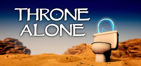
Throne Alone scored 68/100 on Steam Analyzer — Solid for a 3D Platformer capsule. Top priority fix: [uniqueness_polish] Enhance visual polish with signature effects or stylization on the toilet character—add stylistic glow, particle trails, or a distinctive outline style that signals premium craft at all sizes

Capsule scores by dimension

  • Genre Clarity: 7/10 — Quirky physics platformer clearly signaled. The central toilet character with blue glowing face and desert landscape immediately communicate an unconventional, absurdist platformer aesthetic. At tiny size, the toilet silhouette and surreal setting remain identifiable, though the specific 'cursed physics' mechanic isn't visually obvious. The tone is unique enough to stand apart from standard action games.
  • Title Readability: 8/10 — Clean, large sans-serif title legible. THRONE ALONE uses a bold white sans-serif with strong contrast against the sky gradient background, reading clearly at both full and small sizes. The letterforms remain distinct even at tiny thumbnail scale due to weight and spacing. The title avoids decorative frills that would collapse at small sizes.
  • Contrast & Color: 7/10 — Good light-dark separation with warm tones. White title text and cyan toilet details pop cleanly against the warm orange desert and cool blue sky gradient. The composition uses complementary warm-cool contrast effectively. At tiny size, the light toilet object stands out, though some mid-tone detail in the rocks softens overall silhouette punch slightly.
  • Uniqueness & Polish: 6/10 — Distinctive concept, execution feels competent. The anthropomorphized toilet in a desert with a floating roasting face is genuinely unique and memory-forming, clearly differentiating from combat-focused action games. However, the overall rendering and effects are functional rather than exceptional, with no signature stylistic flourish that elevates it beyond competent indie craft. The concept carries the visual identity more than polished art direction.
  • Brand Consistency: 6/10 — Memorable toilet motif, limited identity depth. The toilet character will be recognizable as the game's icon across touchpoints, and the desert setting is cohesive. However, without access to verify palette and style consistency across the 11 store screenshots, the capsule shows a single strong motif rather than a layered, multi-element brand language. The cyan glow is a signature accent color.
  • Composition: 7/10 — Balanced focal point with clear hierarchy. The toilet sits as a clear primary subject in the center-right mid-ground, with the title anchored above in safe space and desert landscape providing compositional weight below. The layout has good depth separation between foreground title, mid-ground character, and background landscape. At small size the focal point remains clear; no critical elements risk Steam edge cropping.

What works

  • Title legibility across all sizes. Bold white sans-serif with strong sky contrast reads clearly from full size down to tiny thumbnail without losing letterform integrity.
  • Memorable unique concept. A cursed toilet in a desert with a roasting AI face is sufficiently absurdist and novel to stand out from typical action game capsules.
  • Clear focal point hierarchy. The toilet character anchors the composition with supporting landscape elements that guide rather than compete for attention.

What hurts the capsule

  • Generic polish relative to top-tier benchmarks. Compared to HELLDIVERS 2 or Black Myth: Wukong, the visual craft feels competent but not exceptional, relying on concept novelty over execution excellence.
  • Limited art direction distinctiveness. The rendering style and effects are functional without a signature visual language that would make this capsule instantly recognizable outside the toilet motif.
  • Mid-tone softness in silhouette. The warm orange desert rocks and mid-range sky tones slightly reduce the crisp silhouette separation that would elevate contrast scoring at thumbnail size.

Priority fixes

  1. [uniqueness_polish] Enhance visual polish with signature effects or stylization on the toilet character—add stylistic glow, particle trails, or a distinctive outline style that signals premium craft at all sizes
  2. [contrast_color] Increase toilet silhouette definition by adding a darker outline or shadow rim that separates it more crisply from background at tiny size
  3. [brand_consistency] Verify that the cyan glow color and desert palette are consistently applied across store screenshots and key art to reinforce visual recognition

Store copy priority fixes

  1. [feature_communication] Add 1-2 sentences explaining the core physics mechanic: how momentum works, what 'launching' entails (e.g., 'rotate and build momentum, then release to fling yourself toward platforms'), and whether angle or timing is the primary skill.
  2. [audience_targeting] Insert a sentence acknowledging difficulty options or an accessible mode (e.g., 'Customize difficulty to match your skill level' or 'Play at your own pace with no time pressure'), which aligns with the category tag 'Playable without Timed Input' and broadens the audience without diluting the 'punishing' promise.
  3. [uniqueness] Expand the differentiator beyond toilet humor: clarify what the 'otherworldly realm' and 'mysterious desert testing ground' add to the narrative or gameplay beyond visuals, or explain how the Supervisor's commentary evolves and adds strategic depth beyond insults.

Related guides

Steam app ID: 3871150 · Tags: 3D Platformer, Parkour, Difficult, Platformer, Action-Adventure