Scoring genre clarity...

Death in the Manor capsule

Death in the Manor

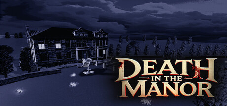
Death in the Manor is a casual isometric point and click murder mystery game. You have 1 hour to discover the killer and weapon before the police arrives. Every game is procedurally generated: rooms change place, suspects are never the same, and there are 22 potential murder weapons.

$4.992 user reviews
Interactive FictionPuzzlePoint & Click
Active Dog StudioNov 13, 2025

Death in the Manor scores 67/100 — better than 26% of Interactive Fiction capsules (n=1,043).

2 user reviews · $4.99 · Released Nov 13, 2025 · By Active Dog Studio

Quick text summary

Death in the Manor scored 67/100 on Steam Analyzer — Solid for a Interactive Fiction capsule. Top priority fix: [contrast_color] Increase value separation by adding a warm accent light or torch glow on the character or manor entrance to brighten the focal area and reduce blending with the dark background.

Capsule scores by dimension

  • Genre Clarity: 7/10 — Mystery detective game recognizable. The isometric manor setting with a character examining the scene immediately signals a detective or mystery game. The nighttime outdoor crime scene, building architecture, and investigative pose clearly establish the murder mystery genre at full size. At TINY size, the silhouette reads as a person near a house, which conveys 'investigation' but loses specific genre cues like the procedural twist and time pressure mechanics.
  • Title Readability: 8/10 — Title clear, gold serif readable. The gold serif 'DEATH IN THE MANOR' text uses strong contrast against the dark blue sky background and maintains excellent legibility at full and small sizes. The centered placement and substantial point size ensure the title remains readable even at TINY thumbnail scale. The serif font is decorative but proportioned large enough that letterforms do not collapse at reduced sizes.
  • Contrast & Color: 7/10 — Gold title pops, background muddy. The warm gold serif title creates excellent value separation and immediately stands out against the cool dark blue sky, with clear edge definition that persists at small sizes. However, the manor building and investigative scene use predominantly dark and muted blue-gray tones that blend together, reducing overall silhouette clarity against the Steam background. The grayscale test shows the scene lacks strong mid-to-light contrast that would help the central character and building read distinctly at TINY size.
  • Uniqueness & Polish: 6/10 — Competent but visually generic. The capsule presents a polished isometric environment with reasonable lighting and architectural detail, but the nighttime manor crime scene is a familiar visual trope in mystery media with no distinctive hook or standout art direction. The character model and environment rendering are competent but do not communicate the unique procedural generation, 1-hour time limit, or 22-weapon mechanic that differentiates the game. The overall execution is clean but reads as a generic mystery aesthetic rather than a memorable premium identity.
  • Brand Consistency: 5/10 — Generic mystery style, no signature. The dark gothic manor, nighttime atmosphere, and serif title treatment are standard mystery genre conventions that do not create a distinctive brand identity unique to Death in the Manor. Without reference to the 11 store screenshots, the capsule does not establish an iconic character, palette, or motif that would be recognizable as this specific title across multiple touchpoints. The design is internally coherent but lacks memorable identity signals that distinguish it from other casual mystery games.
  • Composition: 7/10 — Balanced layout, clear focal point. The manor building occupies the left-center of the frame with the investigating character positioned as the primary subject, creating a clear visual hierarchy with depth layering between the building silhouette and sky background. The gold title anchors the right side with sufficient breathing room and does not collide with key scene elements, maintaining safe margins for Steam's potential crop behavior. At TINY size, the composition remains readable with the manor and character as a unified focal point, though the background sky feels somewhat empty.

What works

  • Strong title contrast and legibility. The large gold serif 'DEATH IN THE MANOR' maintains excellent readability at all sizes from full header to TINY thumbnail against the dark sky background.
  • Clear investigative scene setup. The isometric manor with a character examining the area immediately communicates a detective or mystery genre without confusion.
  • Balanced composition and safe margins. The layout positions the manor on the left, character center-left, and title right without crowding edges or leaving awkward dead space.

What hurts the capsule

  • Muddy background color range. The dark blue-gray manor, trees, and sky blend together in the same value range, reducing silhouette clarity and silhouette separation at small sizes.
  • Generic mystery aesthetic. The nighttime gothic manor and detective pose rely on familiar tropes with no distinctive visual hook or unique selling point communicated in the capsule.
  • No brand identity or signature motif. The capsule uses standard mystery conventions that could apply to dozens of similar games, with no iconic character, symbol, or color palette that signals this specific title.
  • Mechanical depth not visualized. The capsule does not hint at the procedural generation, 1-hour time limit, multiple weapons, or suspect variety that differentiates the game from generic mystery competitors.

Priority fixes

  1. [contrast_color] Increase value separation by adding a warm accent light or torch glow on the character or manor entrance to brighten the focal area and reduce blending with the dark background.
  2. [uniqueness_polish] Introduce a visual signature unique to Death in the Manor, such as a distinctive UI element, character silhouette detail, or warm color accent that hints at the game's procedural and time-pressure mechanics.
  3. [genre_clarity] Add a subtle visual cue like a weapon outline, clock icon, or suspect silhouette in the background to signal the procedural murder mystery hook and differentiate from generic detective games.
  4. [composition] Consider lightening or simplifying the sky gradient to create more visual separation between the title and background, making the gold text even more dominant at TINY size.

Store copy priority fixes

  1. [hook_strength] Rewrite the short description opening to lead with an emotional hook or unique sell: 'You have 1 hour to solve a murder in a mansion that rearranges itself every game—identify the killer before the police shut you down.' This moves from genre labels to action and consequence.
  2. [tone_match] Remove or rewrite formal phrases like 'Step Into the Role of a Classic Detective' and 'Immerse yourself in rich color' to match the casual indie voice. Opt for conversational language: 'Interview suspects and hunt for the murder weapon' instead.
  3. [feature_communication] Consolidate and reduce repetition of procedural generation across sections. Explain why it matters in one cohesive paragraph: 'Every mansion is different—rooms shift, suspects change, and motives are unique each playthrough, ensuring no two mysteries are alike.'
  4. [audience_targeting] Add one sentence clarifying which player type should buy: 'Perfect for casual players who love detective puzzles and replayability' or 'Challenging roguelike mystery for players who enjoy quick, high-stakes runs.' This removes ambiguity about difficulty and game loop intensity.

Related guides

Steam app ID: 3871590 · Tags: Interactive Fiction, Puzzle, Point & Click, Action-Adventure, 3D