Scoring genre clarity...
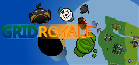
A top-down battle royale with... a style meter? An offline battle royale? I know you want to try battling with highly trained AIs that will put up a fight with even the most talented players! Customizable characters, a battle pass, challenges, and much more come in this free indie game!
Free to Play4 user reviews
Battle RoyaleTop-Down ShooterTop-Down
PlasmaticMay 4, 2026