Scoring genre clarity...
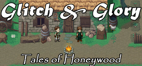
Glitch and Glory: Tales of Honeywood is a parody RPG where you, an adventurer, tackle absurd quests in a satirical MMORPG world. Save sheep, negotiate with ghosts, and avoid fines. Sarcastic dialogue, impactful choices, and retro graphics await!
$11.99
Early AccessAdventureComedy
Victoria GamesAug 28, 2025