Scoring genre clarity...
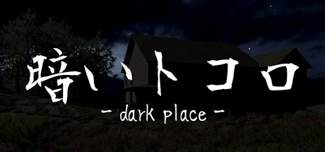
In the darkness, they are approaching. The protagonist is a detective who has come to the location to search for a person who has disappeared at a haunted spot. A horror game played from a first-person perspective. Can you safely escape from the terrifying abandoned house?
$1.993 user reviews
AdventureWalking SimulatorHidden Object
黒子ラボAug 18, 2025