Scoring genre clarity...

Life in Jasskia: a Coffee Shop capsule

Life in Jasskia: a Coffee Shop

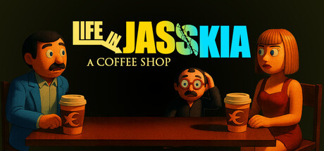
A political-economic shop survival game. In a world nearing its end, the national and global agenda in crisis-stricken Jasskia shifts every day. In the middle of it all, build your business, meet people, witness unsettling truths, find ways to make money, and prepare for the coming end.

$8.99
EconomyPoliticalShop Keeper
Ak Ene EntertainmentMar 31, 2026

Life in Jasskia: a Coffee Shop scores 75/100 — better than 55% of Economy capsules (n=1,074).

$8.99 · Released Mar 31, 2026 · By Ak Ene Entertainment

Quick text summary

Life in Jasskia: a Coffee Shop scored 75/100 on Steam Analyzer — Good for a Economy capsule. Top priority fix: [genre_clarity] Introduce subtle visual cues of crisis or economic tension—cracked signs, boarded areas, or darker atmospheric elements—to signal the survival layer without compromising the coffee shop setting.

Capsule scores by dimension

  • Genre Clarity: 7/10 — Coffee shop sim clearly signaled. The capsule immediately establishes a business simulation with two characters flanking coffee cups and a barista behind a counter, supported by the readable subtitle 'A COFFEE SHOP.' At tiny size, the coffee cups and shop setting remain visible, though the political-economic survival layer is invisible without text. Genre iconography is present but the darker tone and crisis context don't read from visuals alone at small sizes.
  • Title Readability: 8/10 — Bold title clear at all sizes. The main title 'LIFE in JASSKIA' uses large, high-contrast yellow and cyan lettering that remains readable at small and tiny sizes, with 'in' in lowercase providing visual rhythm. The subtitle 'A COFFEE SHOP' is smaller but maintains legibility at small size; at tiny it becomes marginal but the main title holds strong. The split-color treatment (yellow/cyan) adds visual interest without sacrificing clarity.
  • Contrast & Color: 8/10 — Strong warm-cool separation pops. Bright yellow and cyan title elements create excellent value separation against the dark background, with warm orange/brown character tones adding depth and complementary contrast. The character silhouettes have warm backlighting that lifts them from the dark stage, and the red/orange floor grounds the composition. At tiny size, the yellow title and character warm tones remain distinctly readable against the dark field.
  • Uniqueness & Polish: 7/10 — Stylized 3D characters add personality. The capsule features distinctive cartoon-3D rendered characters with expressive faces and intentional art direction that feels more premium than generic asset work. The scene composition—two customers flanking a central barista—suggests narrative and interaction potential unique to this game. However, the overall aesthetic remains somewhat familiar within the simulation genre, and the visual hook doesn't scream 'political-economic crisis survival' at first glance.
  • Brand Consistency: 7/10 — Consistent stylized character rendering. The three characters display consistent 3D cartoon art style, warm color grading, and expressive design language that signals a cohesive vision. The warm orange/brown lighting palette and character proportions appear designed for recognition. Without access to the 17 store screenshots, internal cohesion within this image is strong, though the political-crisis narrative theme is not visually reinforced here in a way that builds memorable brand identity around the core mechanic.
  • Composition: 8/10 — Balanced three-point character focus. Three characters create a stable triangular composition with the barista centered and two customers flanking, naturally guiding the eye and establishing the coffee shop premise. The elevated stage with warm floor lighting creates clear foreground-background separation. Title placement at top is safe from Steam cropping, and the composition remains readable at small size; at tiny size the focal characters compress slightly but remain distinct as silhouettes.

What works

  • Expressive character design. The three stylized 3D characters have distinctive faces and poses that convey personality and narrative intrigue, elevating the capsule beyond generic simulation assets.
  • High-contrast title visibility. The split yellow/cyan 'LIFE in JASSKIA' title maintains strong readability across full, small, and tiny viewing sizes with excellent value separation against dark background.
  • Clear visual hierarchy. The triangular character arrangement and warm stage lighting create a focused composition that reads instantly, with supporting elements reinforcing the coffee shop setting without clutter.
  • Warm color grading cohesion. Consistent orange/brown lighting across all characters and environment creates a unified, premium visual mood that feels intentional rather than generic.

What hurts the capsule

  • Crisis theme visually absent. The cheerful, warm coffee shop aesthetic does not communicate the political-economic survival or 'world nearing its end' narrative promised in the description, risking genre expectation mismatch.
  • Survival mechanic obscured. No visual cues hint at scarcity, crisis, strategy, or the high-stakes elements that differentiate this from a cozy shop sim, leaving the unique selling point unclear at small sizes.
  • Subtitle legibility drops sharply. The 'A COFFEE SHOP' subtitle becomes difficult to parse at tiny size, and at small size it requires focus, potentially losing casual viewers who skip past.

Priority fixes

  1. [genre_clarity] Introduce subtle visual cues of crisis or economic tension—cracked signs, boarded areas, or darker atmospheric elements—to signal the survival layer without compromising the coffee shop setting.
  2. [contrast_color] Increase subtitle size or reposition it to a high-contrast zone to maintain readability at small and tiny sizes while preserving title prominence.
  3. [uniqueness_polish] Add a distinctive motif or symbol (crisis meter, calendar, warning sign) that visually communicates the political-economic mechanic and distinguishes this from generic shop sims.
  4. [composition] Test the capsule at small and tiny sizes to confirm the central barista remains the clear focal point and character expressions don't blur into an indistinct cluster.

Store copy priority fixes

  1. [feature_communication] Add 1–2 sentences after the NPC section clarifying what happens if a player offends NPCs or takes controversial political stances—do relationships become hostile? Do certain shops or tenders close? This would elevate the perceived depth of political choice.
  2. [hook_strength] Rewrite the short description's final clause from "prepare for the coming end" to a concrete consequence, e.g., "...and accumulate enough wealth before the collapse, or lose everything." This sharpens the existential stakes.
  3. [feature_communication] Insert a single sentence in the main body noting that this is an Early Access title and mention one or two planned additions (e.g., "multiplayer economy," "more NPC storylines") to set expectations and indicate ongoing development.
  4. [uniqueness] Add a comparison sentence such as "Unlike traditional shop sims, your success depends not on customer satisfaction alone but on reading and reacting to daily geopolitical shifts" to further crystallize differentiation for players familiar with the genre.

Related guides

Steam app ID: 3880150 · Tags: Economy, Political, Shop Keeper, Simulation, Survival