Scoring genre clarity...

Matchuie capsule

Matchuie

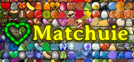
Matchuie is a fun and flexible match-three game with hundreds of levels and unique themes to explore. Play at your own pace, then get creative by turning any image into your own match-three masterpiece. Share your designs and discover what others have made!

$2.99No user reviews
CasualMatch 3Puzzle
BiBa SoftwareAug 21, 2025

Matchuie scores 80/100 — better than 89% of Casual capsules (n=10,153).

No user reviews · $2.99 · Released Aug 21, 2025 · By BiBa Software

Quick text summary

Matchuie scored 80/100 on Steam Analyzer — Good for a Casual capsule. Top priority fix: [uniqueness_polish] Introduce a visual element that hints at the user-generation mechanic—such as a hand gesture, design tool icon, or stylized 'create' motif integrated into the title or grid composition to differentiate from generic match-three games.

Capsule scores by dimension

  • Genre Clarity: 9/10 — Match-three puzzle instantly recognizable. The capsule displays a dense grid of colorful match-three game pieces with hearts, gems, and orbs that immediately communicate casual puzzle gameplay. Even at tiny size, the distinctive candy/gem cluster aesthetic clearly signals a match-three mechanic, and the thematic variety of objects (hearts, orbs, geometric shapes) reinforces the 'unique themes' value proposition. The visual language is unambiguous and sets correct genre expectations.
  • Title Readability: 9/10 — Bold yellow text with clean legibility. The title 'Matchuie' uses a bright, bold yellow sans-serif font with strong contrast against the dark tile background, remaining fully readable at all sizes from full header down to tiny thumbnail. The text is centered with generous spacing and no competing elements, and the letterforms maintain clarity even under squint conditions. At tiny size, the word remains as one of the clearest readable elements on the capsule.
  • Contrast & Color: 9/10 — Vibrant multicolor palette with strong separation. The capsule uses a highly saturated, multi-hued grid of game pieces (reds, oranges, yellows, purples, blues, greens) that create excellent value separation and visual pop against the dark #1b2838 background. Each individual piece reads as a distinct shape with clear edges and silhouette, and the overall brightness and saturation ensure the entire composition stands out immediately in quick scroll conditions. The color variety maintains strong contrast even in grayscale, with light pieces popping clearly against darker neighbors.
  • Uniqueness & Polish: 7/10 — Polished execution slightly limited by genre saturation. The match-three capsule demonstrates solid craft with clean, well-rendered game assets arranged in a professional grid composition that feels premium and intentional. However, the visual approach closely mirrors standard match-three game iconography and doesn't communicate the game's distinctive selling point—the creative 'turn any image into your own match-three' feature—which represents a core differentiator from competitors like Balatro or Minami Lane. The capsule reads as competent but doesn't visually hint at the user-generation mechanic that sets it apart.
  • Brand Consistency: 6/10 — Functional but lacks memorable identity signal. The capsule maintains internal visual cohesion with consistent rendering of game pieces and a unified color palette, but it lacks a distinctive brand hook or memorable identity symbol that could distinguish Matchuie from other casual puzzle games in Steam's ecosystem. The title font and bright aesthetic are pleasant but generic to the match-three category, and there are no signature motifs, character mascots, or unique visual markers that would enable recognition on repeat viewings. The design is clean but not iconic.
  • Composition: 8/10 — Strong grid structure with clear focal hierarchy. The composition uses a tight grid of game pieces that fills the frame effectively while the yellow title is positioned in the lower-middle third with clear visual dominance through size and contrast. The grid itself serves as both background and context, creating depth through piece layering and color variation, with the title acting as the single clear focal point. At small and tiny sizes, the eye immediately lands on the yellow text while the colorful grid supports the overall message without competing for attention or creating clutter.

What works

  • Exceptional title legibility across all sizes. Bright yellow sans-serif 'Matchuie' maintains perfect readability from full header to tiny thumbnail with no collapse or fading, positioned cleanly against game piece background.
  • Instant genre communication via visual language. The match-three piece grid immediately signals casual puzzle gameplay to anyone familiar with the category, communicating genre intent in under one second.
  • Strong color contrast and visual pop. Saturated multicolor palette with high value separation creates excellent presence against dark Steam background and maintains clarity even in quick scroll or grayscale conversion.
  • Professional asset rendering and clean polish. Game pieces are well-rendered with clear silhouettes, consistent lighting, and intentional arrangement that feels premium rather than asset-flipped.

What hurts the capsule

  • Fails to communicate unique selling proposition. The capsule shows standard match-three gameplay but does not visually hint at the distinctive 'create your own match-three from any image' feature that differentiates Matchuie from competitors.
  • Generic visual identity without memorable brand signal. No distinctive character mascot, signature symbol, or unique motif that would enable brand recognition or help the game stand out from other casual puzzle titles.
  • Limited visual storytelling beyond mechanic display. The capsule functions as a feature showcase rather than communicating narrative flavor, tone, or thematic depth that might build emotional connection with potential players.

Priority fixes

  1. [uniqueness_polish] Introduce a visual element that hints at the user-generation mechanic—such as a hand gesture, design tool icon, or stylized 'create' motif integrated into the title or grid composition to differentiate from generic match-three games.
  2. [brand_consistency] Develop a distinctive brand signature—either a mascot character, signature color accent, or recurring visual motif from the game's actual aesthetic—to create a memorable identity that could be recognized across multiple marketing touchpoints.
  3. [genre_clarity] Consider adding a subtle visual indicator of the 'themes' variety (e.g., showing game pieces in 2-3 different stylistic variants or thematic clusters) to communicate the breadth of content while maintaining clarity at small sizes.

Store copy priority fixes

  1. [hook_strength] Rewrite the short description to lead with the creative hook: "Turn your photos into puzzle levels. Matchuie is a match-three game where you design, play, and share creative levels made from your own images."
  2. [feature_communication] Add 2-3 concrete gameplay details in the detailed description: mention how levels progress in difficulty, what match mechanics exist (combos, power-ups, obstacles), and how the image conversion process works.
  3. [uniqueness] Clarify what makes the creative mode special with one sentence like: "Unlike traditional match-three editors, Matchuie's theme creator instantly transforms any photo into playable puzzle pieces, no design experience needed."

Related guides

Steam app ID: 3882460 · Tags: Casual, Match 3, Puzzle, Relaxing, Colorful