Scoring genre clarity...
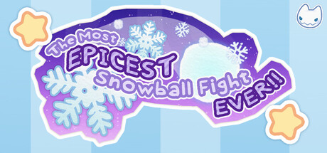
The snowball fight of your dreams! Take up arms against imaginary snow monsters in this charming turn-based tactics game where a child's imagination is their greatest weapon. Can you defeat the forces of the evil Baron von Slushie?
Free to PlayPositive(16)
StrategyStylizedColorful
Team SnowballAug 26, 2025