Scoring genre clarity...
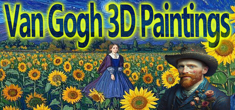
This is a 3D interactive game introducing all the paintings of the famous Dutch post-impressionist painter Vincent van Gogh. Van Gogh's representative works include "The Starry Night", the self-portrait series, and the sunflower series, etc. He painted a total of 2,051 paintings。
$0.991 user reviews
CasualEducation3D Platformer
Rose21Oct 5, 2025