Scoring genre clarity...
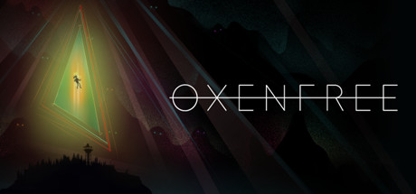
Oxenfree is a supernatural thriller about a group of friends who unwittingly open a ghostly rift. You are Alex, and you’ve just brought your new stepbrother Jonas to an overnight island party gone horribly wrong.
$9.99Very Positive(13)
Story RichChoices MatterAtmospheric
Night School StudioJan 14, 2016