Scoring genre clarity...
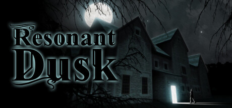
Unravel the secrets of the Bariton mansion! Take on the mantle of detective in the role of Lucas Usher, and solve the riddles plaguing the ghosts of those left behind! Uncover their secrets and help them find salvation … or damnation.
$9.997 user reviews
ExplorationInteractive Fiction3D
Verdite InteractiveOct 13, 2025