Scoring genre clarity...
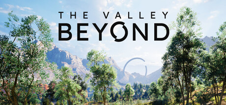
Combining exploration, puzzles, and platforming, The Valley Beyond sends you on vacation to a gorgeous park filled with works of art. But something is wrong, and you soon realize there’s no way out. To escape, you’ll have to uncover all of the park’s secrets.
$7.902 user reviews
Action-AdventureAtmosphericExploration
Marmot LabNov 20, 2025