Scoring genre clarity...

Dear me, I was... capsule

Dear me, I was...

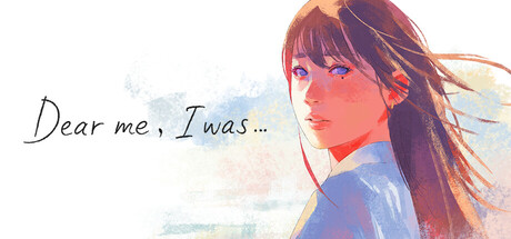
A short tale, a long journey. With a beautiful watercolor touch, it depicts the life of a woman. In her ordinary and modest life...experience her joys, her sorrows, her growth. Witness the story she spins in a life woven by those around her.

$7.99Very Positive(56)
AtmosphericCasualVisual Novel
Arc System WorksFeb 12, 2026

Dear me, I was... scores 68/100 — better than 20% of Atmospheric capsules (n=5,293).

Very Positive (56 reviews) · $7.99 · Released Feb 12, 2026 · By Arc System Works

Quick text summary

Dear me, I was... scored 68/100 on Steam Analyzer — Solid for a Atmospheric capsule. Top priority fix: [title_readability] Replace handwritten script with a semi-decorative sans-serif that maintains personality but retains readability at 120px width; ensure minimum 2px stroke weight

Capsule scores by dimension

  • Genre Clarity: 7/10 — Narrative adventure clear, character-driven. The watercolor art style and contemplative female character immediately signal a story-driven adventure game focused on personal narrative and emotional journey. At tiny size, the soft feminine silhouette and introspective pose remain readable, though the specific genre subtype (narrative vs. action adventure) is slightly ambiguous without additional UI cues.
  • Title Readability: 5/10 — Script font compromises tiny legibility. The handwritten script typeface 'Dear me, I was...' reads clearly at full header size but becomes noticeably fragile and difficult to parse at tiny thumbnail size due to thin letterforms and cursive flow. The tagline text dissolves into illegibility at 120x45 resolution, forcing reliance on visual recognition rather than readable words.
  • Contrast & Color: 7/10 — Warm watercolor palette reads well small. The warm peachy-orange and blue tones create good separation from Steam's dark background, with the character's face and hair providing clear silhouette definition even at small size. The watercolor texture maintains sufficient value contrast in grayscale, though the soft diffusion means some edge definition is sacrificed for artistic effect rather than maximum clarity.
  • Uniqueness & Polish: 8/10 — Distinctive watercolor aesthetic, premium craft. The watercolor painting style immediately differentiates this from typical adventure game capsules and conveys a literary, intimate quality that matches the emotional narrative focus. The soft color transitions, delicate brushwork on the character's features, and thoughtful composition demonstrate intentional artistic direction beyond generic asset assembly, positioning this as a craft-forward indie title.
  • Brand Consistency: 7/10 — Cohesive watercolor identity established. The watercolor technique and warm pastel palette create a recognizable visual identity that should carry through to screenshots and marketing materials. The character focus and introspective mood establish a consistent emotional brand, though without access to other store assets, the iconic symbol or motif specificity cannot be fully verified.
  • Composition: 7/10 — Character focal point, safe margins respected. The female character occupies the right-center composition with clear focal hierarchy, allowing the title text to breathe on the left without competing for attention. At small and tiny sizes, the character silhouette remains the dominant visual anchor; however, the title placement slightly loses breathing room at thumbnail sizes where it risks reading as cramped against the edge.

What works

  • Distinctive artistic style. Watercolor aesthetic immediately separates from typical adventure game templates and signals a premium, intimate narrative experience.
  • Strong character silhouette. The female figure's pose and expression remain recognizable and emotionally resonant even at tiny thumbnail resolution.
  • Warm color harmony. Peachy-orange and blue palette pops effectively against Steam dark background while maintaining cohesive, calming mood.

What hurts the capsule

  • Script font fails at tiny size. Handwritten typeface becomes unreadable at 120x45 resolution, relying entirely on visual recognition rather than legible text.
  • Watercolor softness reduces edge clarity. Diffuse brushwork and soft transitions sacrifice silhouette crispness, making fine details disappear in quick-scroll scenarios.
  • Limited gameplay visual language. Pure portraiture does not communicate specific gameplay mechanics or adventure subtype, leaving genre slightly ambiguous beyond 'narrative focus.'

Priority fixes

  1. [title_readability] Replace handwritten script with a semi-decorative sans-serif that maintains personality but retains readability at 120px width; ensure minimum 2px stroke weight
  2. [contrast_color] Add subtle dark outline or shadow behind the title text to increase separation from the character and background watercolor transitions
  3. [composition] Shift title slightly higher and left to create more breathing room between text baseline and image edge; verify no crop loss at Steam thumbnail display
  4. [genre_clarity] Consider adding a subtle UI element or secondary object (journal, path, symbolic motif) that hints at the specific adventure mechanic without cluttering the character focus

Store copy priority fixes

  1. [hook_strength] Rewrite the short description to open with 'Experience the intimate life story of one woman through beautiful watercolor visuals and original music' to immediately clarify genre and tone before pivoting to emotional resonance.
  2. [genre_clarity] Add to the short description: 'A textless visual novel you can complete in under an hour' to front-load genre identification and set correct player expectations.
  3. [feature_communication] Define 'simple interactive elements' by specifying the primary interaction model: e.g., 'Click to progress through scenes' or 'Guide the story through gentle choices,' so players understand the gameplay loop.
  4. [uniqueness] Add a sentence explaining what makes this woman's story distinctive: e.g., 'Told entirely through watercolor visuals without text, her journey unfolds as a visual poem' to differentiate from other narrative games.

Related guides

Steam app ID: 3891510 · Tags: Atmospheric, Casual, Visual Novel, Cinematic, 2D