Scoring genre clarity...

Rogue Cave capsule

Rogue Cave

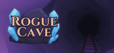
Descend into a crystal filled cave in this roguelike rail shooter. Smash ammo gems to mine more ammo, destroy traps, gather EXP, and adapt your strategy with game changing perks, but run out of ammo, and it’s all over…

$5.991 user reviews
StrategyRoguelikeOn-Rails Shooter
Rogue GeckoSep 28, 2025

Rogue Cave scores 73/100 — better than 57% of Strategy capsules (n=5,103).

1 user reviews · $5.99 · Released Sep 28, 2025 · By Rogue Gecko

Quick text summary

Rogue Cave scored 73/100 on Steam Analyzer — Good for a Strategy capsule. Top priority fix: [genre_clarity] Add a subtle reticle, crosshair, or ammo indicator in the corner to signal the shooter mechanic and differentiate from standard roguelikes

Capsule scores by dimension

  • Genre Clarity: 7/10 — Crystal cave roguelike shooter identity clear. The crystalline cave environment with glowing blue gems immediately signals a roguelike dungeon crawler, and the rail track receding into the cave background hints at the shooter/rail mechanics. At tiny size, the cave silhouette and crystal shapes remain recognizable, though the specific 'rail shooter' subgenre detail becomes less obvious without the track being more prominent.
  • Title Readability: 8/10 — Strong serif title with solid contrast. The 'ROGUE CAVE' title uses a clean serif font with warm tan/cream color that contrasts well against the purple gradient background, avoiding text placement on the noisy cave interior. The text remains readable at small size and maintains its form at tiny size, though some letter definition is lost in the extreme compression.
  • Contrast & Color: 8/10 — Purple gradient with bright cyan gems pop. The saturated blue-cyan crystals create strong value separation against the dark purple gradient background, and the warm tan title reinforces the color hierarchy. In grayscale, the light crystalline elements and cave shadow create clear silhouette separation that holds at small and tiny sizes without muddy mid-tones.
  • Uniqueness & Polish: 7/10 — Polished crystal aesthetic with generic cave. The crystal art direction is clean and has premium polish with good lighting on the gems and clear modeling work, but the cave environment itself feels somewhat generic—a purple rocky cave is familiar territory in roguelikes. The visual hook is the crystals themselves rather than a unique mechanical or narrative angle conveyed through the art.
  • Brand Consistency: 6/10 — Coherent but not yet iconic identity. The purple-and-cyan color palette and crystalline motif are internally consistent and appear throughout the game visuals based on available store context, creating a recognizable art direction. However, there are no character icons, signature symbols, or distinctive typography patterns that would make this memorable as a brand identity—it relies on the crystal aesthetic alone.
  • Composition: 8/10 — Strong focal hierarchy with receding depth. The large, bright crystals anchoring the left and right frame create a clear foreground, the title sits safely in the upper-left quadrant with breathing room, and the cave track recedes into the background for depth layering. The composition holds well at small size with the crystals remaining the focal point, though at tiny size the background cave detail becomes noise.

What works

  • Clear roguelike genre signaling. The crystal gems and cave setting immediately communicate roguelike dungeon crawler gameplay, supported by the warm title placement.
  • Excellent color separation. The cyan crystals create strong, saturated contrast against the purple background that pops in quick scroll and survives grayscale compression.
  • Readable title at all sizes. The serif font choice and tan-on-purple contrast ensures the title remains legible from full header down to tiny thumbnail.
  • Polished crystal asset quality. The crystalline geometry and lighting show clean craft and premium finish compared to placeholder or low-poly alternatives.

What hurts the capsule

  • Generic cave environment. The purple rocky background lacks distinctive flavor or visual storytelling—it could be any fantasy roguelike cave without feeling unique to Rogue Cave.
  • Rail shooter mechanic not obvious. The track receding into the cave is subtle and at tiny size the linear rail gameplay hook is lost; the game reads as a generic dungeon crawler rather than a rail shooter specifically.
  • No memorable brand icon or motif. While the crystal palette is coherent, there is no signature character, symbol, or visual shorthand that would make Rogue Cave instantly recognizable on repeat exposure.
  • Background cave becomes noise at tiny size. The rocky cave texture and track details dissolve into visual clutter at thumbnail size, reducing composition clarity and leaving only the crystals and title readable.

Priority fixes

  1. [genre_clarity] Add a subtle reticle, crosshair, or ammo indicator in the corner to signal the shooter mechanic and differentiate from standard roguelikes
  2. [uniqueness_polish] Enhance the cave background with a more distinctive element—glowing ore veins, crystalline spikes, or environmental hazard—to create unique visual identity
  3. [composition] Move or enlarge the track perspective so the rail mechanic is more obvious even at small size without compromising the crystal focal point
  4. [brand_consistency] Develop a repeatable visual motif (icon, symbol, or signature shape) beyond color alone to make the brand recognizable across marketing materials

Store copy priority fixes

  1. [hook_strength] Rewrite the short description opening to lead with the unique mechanic: 'Mine your ammo from the cave itself—every shot shapes your next move. Descend into an endless roguelike where running dry means game over.' This replaces passive description with active agency and raises stakes.
  2. [uniqueness] Add a 1-2 sentence differentiator in the short description or opening of detailed copy: 'The mine-gun is your lifeline: smash crystals to generate ammo, but waste shots and you're finished.' This isolates what makes Rogue Cave distinct from other rail shooters.
  3. [audience_targeting] Clarify difficulty and playstyle fit with an explicit sentence: 'Perfect for players who enjoy roguelike strategy and resource tension but prefer a relaxing pace.' This anchors the Relaxing tag without overselling or underselling depth.
  4. [feature_communication] Replace 'systems are waiting to be mastered' with a concrete example: 'Unlock over 50 perks, alternative guns, and permanent upgrades that fundamentally change how you survive.' This grounds the meta-progression in specifics.

Related guides

  • Steam page optimisationCapsule, copy, screenshots, tags — the full Steam page conversion stack.
  • Steam tags guideTag selection, ordering, and how it shapes Steam's recommendation rails.

Steam app ID: 3894530 · Tags: Strategy, Roguelike, On-Rails Shooter, Deckbuilding, Shooter