No Peeking scores 68/100 — better than 18% of Casual capsules (n=10,153).

Quick text summary

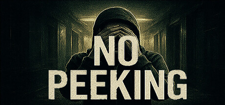
No Peeking scored 68/100 on Steam Analyzer — Solid for a Casual capsule. Top priority fix: [uniqueness_polish] Introduce a distinctive visual element such as a quirky character expression, playful color accent, or signature symbol that hints at the chaotic multiplayer humor and differentiates from generic mystery games.

Capsule scores by dimension

  • Genre Clarity: 7/10 — Social multiplayer humor game clear. The hooded figure in a hiding pose with the bold 'NO PEEKING' text immediately communicates a hide-and-seek mechanic and playful tone. The moody atmospheric lighting and figure's posture suggest stealth and mischief typical of casual multiplayer party games. At tiny size, the silhouette and text remain readable enough to convey 'hiding game' though the exact subgenre (social multiplayer) is inferred rather than explicit.
  • Title Readability: 8/10 — Bold sans-serif title, strong legibility. The 'NO PEEKING' text uses a thick, blocky sans-serif typeface in off-white against a dark background with subtle glow/halo effects that enhance separation. The title placement is centered and prominent across the middle of the composition, avoiding noisy backgrounds. At small and tiny sizes the text remains clear and readable due to high contrast and generous letterform weight, though the glow softens slightly at ultra-small scales.
  • Contrast & Color: 8/10 — Strong value separation and silhouette. The off-white text and hooded figure stand out distinctly against the dark teal-green atmospheric background with warm golden accent lighting around the head. The grayscale contrast is excellent—the figure reads as a clear dark silhouette against mid-tone background elements, and the title text maintains strong separation. The warm highlights on the hoodie and background glow provide visual depth without compromising legibility even at tiny viewport sizes.
  • Uniqueness & Polish: 6/10 — Competent but somewhat generic execution. The atmospheric lighting, hooded figure, and mysterious tone are well-executed and thematically appropriate for a hide-and-seek game, but the visual approach feels familiar within the indie game space. The composition lacks a distinctive art style or unique visual hook—it could describe many stealth or mystery games rather than specifically communicating 'chaotic multiplayer party fun.' The polish is solid with clean gradients and coherent mood, but it doesn't stand out as particularly memorable or premium compared to benchmark titles like Lethal Company or Content Warning.
  • Brand Consistency: 5/10 — Atmospheric mood but generic identity. The dark, mysterious aesthetic with hooded figure and moody lighting establishes a consistent tone, but provides no distinctive brand motif, palette, or iconic element that would be recognizable across store screenshots or marketing materials. The visual language leans heavily on generic 'mysterious/secretive' tropes rather than establishing a signature visual identity unique to No Peeking's chaotic multiplayer personality. Without access to the store screenshots, the capsule alone doesn't communicate a memorable brand character or symbol.
  • Composition: 7/10 — Clear focal point, balanced layering. The hooded figure occupies a strong central position as the primary focal point, with the 'NO PEEKING' title integrated directly across the torso creating a unified visual hierarchy. The composition uses three clear layers—background tunnel/hallway, midground atmospheric glow, and foreground figure—which creates depth and visual interest. At small and tiny sizes the focal point remains clear, though the background architectural detail becomes less distinguishable; title placement within safe margins ensures it won't be cropped by Steam's responsive layout.

What works

  • Title contrast and legibility. The off-white sans-serif 'NO PEEKING' text with subtle halo glow maintains excellent readability even at tiny thumbnail size due to high value separation from dark background.
  • Silhouette clarity and depth. The hooded figure reads as a clear, distinct dark silhouette against warm accent lighting, creating visual hierarchy and focal point that survives squinting and small viewport tests.
  • Atmospheric mood cohesion. The dark teal-green palette, warm golden highlights, and moody tunnel setting create a consistent, polished visual mood appropriate for the hide-and-seek theme.

What hurts the capsule

  • Generic visual identity. The mysterious hooded figure and dark atmospheric aesthetic lack distinctive or unique visual elements that communicate 'chaotic multiplayer party fun' specifically rather than generic stealth/mystery themes.
  • Limited brand personality expression. The capsule does not feature any iconic motifs, characters, or signature visual elements that would establish recognizable brand identity or differentiate it from other atmospheric indie games.
  • Missed opportunity for playful tone. The serious, mysterious aesthetic doesn't hint at the chaotic, humorous multiplayer gameplay described in the game's short description, creating a slight disconnect between visual tone and actual experience.

Priority fixes

  1. [uniqueness_polish] Introduce a distinctive visual element such as a quirky character expression, playful color accent, or signature symbol that hints at the chaotic multiplayer humor and differentiates from generic mystery games.
  2. [brand_consistency] Develop a recognizable brand motif (such as peeking eyes, playful character design, or signature palette) that can anchor future store screenshots and marketing materials for consistent identity recognition.
  3. [genre_clarity] Add subtle visual cues that specifically communicate 'social multiplayer' and 'chaotic fun' rather than serious stealth, such as warm humor, playful typography variations, or hints of multiple characters/interactions.

Store copy priority fixes

  1. [feature_communication] Add 2–3 concrete mechanics: e.g., 'Hiders must mimic NPC behavior while avoiding detection zones' or 'Seekers use special vision modes or time-limited scans to find impostors.' Clarify what players actually do moment-to-moment.
  2. [uniqueness] Insert a differentiator: e.g., 'The only hide-and-seek game where you must stay in motion to avoid AI detection' or 'Combines hide-and-seek with [X mechanic] for unpredictable chaos.' Explain why this version is worth playing.
  3. [feature_communication] Expand the detailed description to include round structure, map variety, or progression systems—current copy is under 150 words and lacks gameplay depth.

Related guides

Steam app ID: 3896890 · Tags: Casual, FPS, 3D, First-Person, Dark