Scoring genre clarity...

Super Firefighter capsule

Super Firefighter

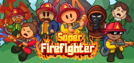
Run into hell and spray it down in this couch coop twin stick shooter. Team up with 1 to 3 friends and save victims, houses and trees from the flames and those who ignite them. Enhance your waterpower with special upgrades designed to beat the heat from the unique fires you'll encounter.

$5.593 user reviews
MultiplayerCo-opCartoony
William GiguèreMay 27, 2026

Super Firefighter scores 77/100 — better than 71% of Multiplayer capsules (n=2,820).

3 user reviews · $5.59 · Released May 27, 2026 · By William Giguère

Quick text summary

Super Firefighter scored 77/100 on Steam Analyzer — Good for a Multiplayer capsule. Top priority fix: [uniqueness_polish] Add a distinctive visual element that communicates core mechanics (e.g., a water spray effect, upgrade icon, or unique fire type) to increase premium polish and memorable differentiation.

Capsule scores by dimension

  • Genre Clarity: 8/10 — Clear action-comedy firefighter theme. The capsule immediately communicates a lighthearted action game through stylized cartoon firefighters in protective gear, flames, and dynamic poses. At tiny size, the colorful character silhouettes and prominent fire graphics remain readable and clearly convey an action-adventure tone. The cartoonish art style with exaggerated proportions and cheerful color palette distinctly separates this from serious shooter competition.
  • Title Readability: 8/10 — Bold, legible title with flame effect. The 'Super Firefighter' title uses bold white lettering with an orange-yellow flame gradient backdrop that provides strong contrast against the dark Steam background. The text remains readable at small and tiny sizes due to thick letterforms and the contained flame background shield. The title placement is centered and strategically isolated from character clutter, ensuring it doesn't compete with other elements.
  • Contrast & Color: 8/10 — Strong value separation and vibrant palette. Characters and fire elements use warm reds, oranges, and yellows that pop distinctly against the green background and dark Steam interface. The grayscale test shows clear silhouette separation between figures and background, with the firefighters' dark outlines and varied skin tones creating readable depth. The white title text provides maximum contrast and remains crisp at all viewing sizes.
  • Uniqueness & Polish: 7/10 — Charming cartoon style with cohesive art. The art direction feels intentional with consistent vector-style character design, expressive faces, and a warm color palette that conveys accessibility and fun rather than generic action game polish. Character poses show personality and teamwork themes (holding hands/standing together), which aligns with the co-op gameplay mechanic. However, the overall execution remains within typical indie game capsule territory without a standout visual hook that would elevate it to premium AAA polish.
  • Brand Consistency: 7/10 — Cohesive cartoon aesthetic, recognizable cast. The capsule maintains a consistent stylized art direction with uniform character design language, warm color palette, and unified rendering that suggests a recognizable game identity. The diverse firefighter roster with distinct silhouettes and color coding creates a memorable cast identity. The cartoonish tone and character-forward design would be recognizable in store screenshots and marketing materials, establishing internal brand coherence.
  • Composition: 8/10 — Balanced ensemble with clear hierarchy. The composition arranges firefighters in an arc formation with the title prominently centered between the flame graphics, creating a natural focal point that guides the eye. At small and tiny sizes, the arrangement reads as a unified group composition without scattered attention or dead space. Characters are well-distributed across the frame with safe margins, and the green background provides adequate breathing room that survives Steam cropping resilience.

What works

  • Strong title contrast and legibility. The white 'Super Firefighter' text with flame gradient background reads clearly at all sizes and maintains excellent contrast against both the capsule background and Steam dark interface.
  • Coherent character-driven identity. The diverse firefighter ensemble with distinct silhouettes and color-coded outfits creates a memorable and recognizable cast that communicates teamwork and co-op gameplay.
  • Warm, cohesive color palette. The reds, oranges, and yellows create strong value separation from the green background and pop effectively against the dark Steam interface, maintaining readability at tiny size.
  • Clear action-comedy genre communication. The cartoonish art style with exaggerated firefighter poses and expressive faces immediately conveys lighthearted action gameplay without confusion.

What hurts the capsule

  • Generic indie game presentation. While charming, the capsule lacks a distinctive premium polish or unique visual hook that would differentiate it from other mid-tier indie action games in the broader market.
  • Limited visual gameplay storytelling. The capsule shows characters and fire but doesn't clearly communicate unique mechanics like water spraying, special upgrades, or the twin-stick shooter gameplay loop that sets it apart.
  • Busy composition at full size. The five characters plus flames create visual density at full size that could benefit from tighter spacing or clearer focal point emphasis to guide viewer attention more deliberately.

Priority fixes

  1. [uniqueness_polish] Add a distinctive visual element that communicates core mechanics (e.g., a water spray effect, upgrade icon, or unique fire type) to increase premium polish and memorable differentiation.
  2. [composition] Reduce overall visual density by tightening character spacing or introducing subtle layering to create stronger depth and clearer primary-secondary focus hierarchy.
  3. [title_readability] Verify the title remains fully legible at true tiny size (120x45) by testing the flame gradient opacity—ensure white text doesn't lose contrast if gradient becomes too translucent.

Store copy priority fixes

  1. [feature_communication] Replace the repeated section with new copy that explains what 'unique fires' means mechanically (e.g., 'forest fires spread naturally, oil fires explode, etc.') and how upgrades change playstyle or strategy.
  2. [uniqueness] Add a differentiating sentence that explains why this game stands out—e.g., 'the only twin stick shooter where fire spreads dynamically and teamwork is required to contain it' or specific mode/level variety that competitors lack.
  3. [feature_communication] Clarify the single-player experience: can you play all 16 levels solo, or is solo mode limited? This affects appeal to the solo tag audience.
  4. [hook_strength] Expand the detailed description opening with a new hook sentence after the mission statement (e.g., 'Chaos erupts in split-screen mayhem—water or fail together') to justify the copy length.

Related guides

Steam app ID: 3898090 · Tags: Multiplayer, Co-op, Cartoony, Local Co-Op, Twin Stick Shooter