Sliding Knight scores 75/100 — better than 69% of Turn-Based Tactics capsules (n=1,210).

Quick text summary

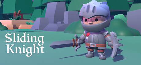
Sliding Knight scored 75/100 on Steam Analyzer — Good for a Turn-Based Tactics capsule. Top priority fix: [genre_clarity] Add subtle visual cues that communicate the 'sliding' or 'grid-based strategy' mechanic, such as arrow indicators or highlighted movement paths on the ground

Capsule scores by dimension

  • Genre Clarity: 7/10 — Clear casual puzzle action vibe. The low-poly 3D knight character and grid-like environment immediately signal a puzzle or strategy game with light action elements. At TINY size, the armored character and structured level design still read as puzzle-game, though the strategic sliding mechanic is not explicitly obvious without the title. The pastel color palette and rounded art style confirm this is casual indie rather than hardcore action.
  • Title Readability: 8/10 — Clean, readable white typography. The title 'Sliding Knight' uses a clear, sans-serif white font positioned on the left side against a controlled teal-green background, avoiding texture overlap. At SMALL and TINY sizes the title remains legible with good letter spacing and weight. The font choice is simple and functional, though not particularly distinctive or memorable for brand recall.
  • Contrast & Color: 8/10 — Strong value separation, warm pop. The white title text pops cleanly against the cool teal-green environment, and the warm red accents on the knight character create visual interest and draw the eye. The silhouette of the knight remains clear even at tiny size due to the cool-warm color split and the character's distinct outline. The pastel purple and gray tones in the background provide good depth separation from the mid-tone green.
  • Uniqueness & Polish: 7/10 — Polished low-poly charm, familiar style. The low-poly 3D art style is clean and well-executed with consistent lighting and material definition, giving the capsule a premium indie feel. However, the low-poly casual style is now relatively common in the indie puzzle space, and the composition lacks a clear visual hook that communicates the core 'sliding' mechanic or strategic depth. The design is competent and charming but does not stand out distinctly from other indie puzzle games.
  • Brand Consistency: 7/10 — Cohesive palette, recognizable character. The pastel teal-green and purple color palette is consistent and distinctive, and the knight character with red accents appears to be a recognizable mascot. The low-poly rendering style is uniform across all visible elements, creating a coherent art direction. Without access to the five store screenshots, internal consistency appears strong and the knight silhouette would likely be memorable across multiple touchpoints.
  • Composition: 8/10 — Clear hierarchy, balanced layout. The knight character is the strong focal point in the center-right, while the title anchors the left side, creating a clear visual balance. The layered background elements (near terrain, mid-tone structures, far background) establish depth and guide the eye effectively. At SMALL and TINY sizes the composition remains readable with no critical elements at dangerous edges, though the knight character could potentially be slightly larger for maximum impact at thumbnail scale.

What works

  • Excellent title contrast and placement. White sans-serif text on a controlled teal background ensures legibility at all sizes, from full header down to tiny thumbnail.
  • Coherent low-poly art direction. Clean 3D rendering style with consistent lighting, materials, and pastel color palette creates a polished, premium indie aesthetic.
  • Strong color separation. Cool-warm color contrast between environment and red knight accents, plus good value range, ensures the design reads clearly even in grayscale or when squinting.
  • Clear focal point hierarchy. The knight character draws immediate attention as the primary subject, with title and environment supporting rather than competing for focus.

What hurts the capsule

  • Generic puzzle game composition. While clean, the layout and character pose do not visually communicate the core 'sliding' mechanic or strategic depth that differentiates this game.
  • Limited visual distinctiveness. Low-poly casual indie style is now common in the genre; the capsule lacks a hook or signature visual element that would make it stand out at quick scroll.
  • Minimal gameplay communication. The character and environment do not hint at the strategic puzzle nature or the limitation of 'limited moves' that is the core selling point.

Priority fixes

  1. [genre_clarity] Add subtle visual cues that communicate the 'sliding' or 'grid-based strategy' mechanic, such as arrow indicators or highlighted movement paths on the ground
  2. [uniqueness_polish] Refine the character pose to suggest movement or planning (e.g., leaning forward, hand raised) to hint at the puzzle-action gameplay loop
  3. [composition] Ensure the knight character remains visually prominent and clear at TINY size by slightly increasing character scale or adding a subtle glow or shadow effect

Store copy priority fixes

  1. [uniqueness] Add a concrete differentiator—e.g., 'The only sliding puzzle game where...' or explicitly contrast the sliding mechanic against grid-based tactics games to clarify why this approach is special.
  2. [feature_communication] Include progression details: number of levels, estimated playtime, or difficulty curve (e.g., 'Over 50 hand-crafted levels ranging from relaxing to brain-bending') to set player expectations.
  3. [hook_strength] Move or trim the narrative epilogue lower in the description or into a separate 'Story' section so the core mechanics hook appears first during a 30-second skim.

Related guides

Steam app ID: 3900190 · Tags: Turn-Based Tactics, Puzzle, Strategy, Cute, Surreal