Scoring genre clarity...

They Hear Footsteps capsule

They Hear Footsteps

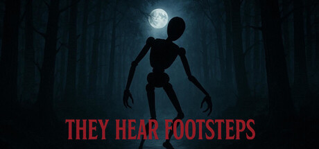
[Visually Disturbing Short Horror] You’re walking through the aftermath of a cannibal’s obsession. He didn’t just take lives — he turned them into something worse. What’s left of his victims still hangs in the dark, staring, twitching, waiting. A stomach turning, gross experience.

$0.993 user reviews
AdventureHorrorAtmospheric
GTINov 4, 2025

They Hear Footsteps scores 73/100 — better than 61% of Adventure capsules (n=7,922).

3 user reviews · $0.99 · Released Nov 4, 2025 · By GTI

Quick text summary

They Hear Footsteps scored 73/100 on Steam Analyzer — Good for a Adventure capsule. Top priority fix: [uniqueness_polish] Add a subtle visual signature element—such as a recurring symbol, distinctive victim pose, or signature gore aesthetic that appears across marketing materials to build iconic brand recall.

Capsule scores by dimension

  • Genre Clarity: 8/10 — Horror atmosphere clearly communicated. The skeletal silhouette, moonlit forest setting, and ominous posture immediately signal horror/survival elements at all sizes. The haunting stance and isolated figure in darkness convey tension and dread, making the genre unmistakable even at tiny size. The visual establishes a supernatural or psychological horror tone without ambiguity.
  • Title Readability: 7/10 — Bold red text readable at small sizes. The all-caps red title 'THEY HEAR FOOTSTEPS' uses high contrast against the dark background and maintains legibility at small and tiny sizes due to its size and bold weight. The sans-serif letterforms are clean and spaced well for quick parsing. At tiny size, letter forms remain distinguishable though some detail softens, but the message stays clear.
  • Contrast & Color: 8/10 — Strong dark-light separation with red pop. The skeletal figure reads clearly as a dark silhouette against the moonlit blue-gray background, creating strong value separation. The red title provides a warm accent that pops against the cool palette and dark Steam background. The grayscale test shows excellent separation: the figure remains distinct and the title maintains clear edges.
  • Uniqueness & Polish: 7/10 — Distinctive horror hook with craft. The skeletal/emaciated figure posture and moonlit forest composition feels deliberately unsettling rather than generic—it communicates the game's specific disturbing premise beyond standard survival horror. The render quality is clean and the atmospheric lighting shows intentional art direction. The visual has a memorable creepy hook that differentiates it from routine horror fare.
  • Brand Consistency: 6/10 — Coherent horror aesthetic internally. The capsule presents a unified dark, moonlit horror atmosphere with consistent cool-toned palette and skeletal imagery that aligns with the game's cannibal/body horror premise. Without access to the 7 store screenshots, internal cohesion appears solid—the mood and tone are locked in. However, there are no distinctive visual motifs, recurring symbols, or iconic character elements visible that would create instant brand recognition on sight alone.
  • Composition: 8/10 — Clear focal point with balanced layout. The skeletal figure occupies strong center-to-upper-center placement, drawing immediate attention with unambiguous hierarchy. The moon in the upper right provides secondary visual interest without competing. The forest depth recedes cleanly into background, creating layered composition that reads well even at tiny size. Title placement at bottom is safe from crop and leaves the subject breathing room.

What works

  • Strong silhouette legibility. The skeletal figure's distinctive pose and dark outline remain instantly recognizable at all viewing sizes, from full header to thumbnail.
  • High contrast title placement. Red text on dark background maintains crisp readability at small sizes without requiring perfect vision or close inspection.
  • Cohesive horror atmosphere. The moonlit forest, skeletal figure, and eerie tone work together to communicate a specific unsettling premise rather than generic spook.
  • Effective depth layering. Forest background, mid-tone lighting, and foreground figure create visual hierarchy that reads clearly even when compressed to thumbnail size.

What hurts the capsule

  • Limited distinctive brand identity. While the horror is clear, there are no recurring visual motifs, character designs, or signature color palettes that would create iconic brand recognition beyond 'generic horror.'
  • Minimal visual variety in composition. The single skeletal figure in dark forest setting is thematically tight but offers limited storytelling complexity or secondary focal hooks compared to top-tier horror titles.
  • No gameplay hint or unique mechanic cue. The capsule communicates atmosphere and genre but doesn't visually hint at what makes this specific game's mechanics or experience distinct from other horror titles.

Priority fixes

  1. [uniqueness_polish] Add a subtle visual signature element—such as a recurring symbol, distinctive victim pose, or signature gore aesthetic that appears across marketing materials to build iconic brand recall.
  2. [genre_clarity] Consider incorporating a subtle UI element or first-person perspective hint (e.g., shadowed hands in frame) to reinforce the 'walking through aftermath' simulation aspect and differentiate from passive horror observation.
  3. [brand_consistency] Verify the forest/moon color palette and skeletal figure style are repeated consistently across all store screenshots and media to ensure players instantly recognize this game's visual language.

Store copy priority fixes

  1. [feature_communication] Add a specific playtime estimate (e.g., '2–3 hour experience') and clarify one concrete player action beyond walking (e.g., 'observe crime scenes for audio logs' or 'navigate to specific locations') to ground gameplay.
  2. [feature_communication] Specify whether the experience is linear, branching, or open-world exploration to help players understand the pacing and structure.
  3. [audience_targeting] Add a content warning line such as 'Contains graphic depictions of body horror and psychological trauma' to set explicit boundaries and protect audience trust.

Related guides

Steam app ID: 3901600 · Tags: Adventure, Horror, Atmospheric, Exploration, Action-Adventure