Scoring genre clarity...
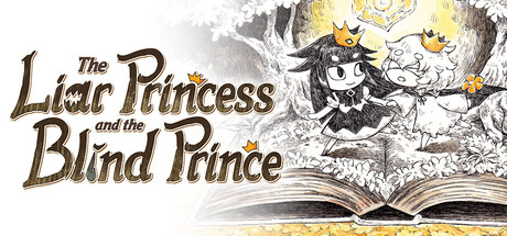
Embark on a journey to save the prince’s eyesight in this 2D puzzle-adventure game featuring beautiful hand-drawn art and a bittersweet tale of wishes and what we’re willing to do to make them come true. Utilize your wolf and princess forms to lead the way!
$19.99Very Positive(24)
Hand-drawnCutePuzzle Platformer
Nippon Ichi Software, Inc., Systemsoft beta, Inc.Mar 11, 2026