Scoring genre clarity...
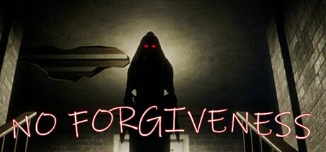
In this psychological horror, you are a guilt-ridden, drunken father who wakes in his dark room, alone. As you search for your missing family, reality twists, and madness takes hold. Something is watching, guiding you—will you uncover the truth, or become its victim?
$1.998 user reviews
AdventureWalking SimulatorHidden Object
VimmGamesAug 23, 2025