Super Rush! Delivery scores 75/100 — better than 63% of Runner capsules (n=471).

Quick text summary

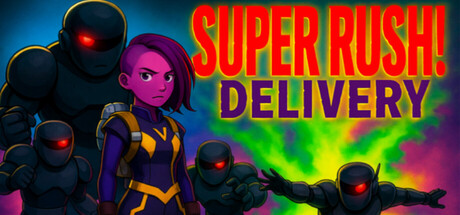
Super Rush! Delivery scored 75/100 on Steam Analyzer — Good for a Runner capsule. Top priority fix: [title_readability] Consolidate title to single line or increase vertical spacing between SUPER RUSH! and DELIVERY to prevent letterform collision at tiny sizes, and test color contrast of secondary line against the background gradient.

Capsule scores by dimension

  • Genre Clarity: 8/10 — Action runner with clear gameplay signals. The capsule immediately communicates a fast-paced action game through dynamic character poses, glowing robot antagonists with aggressive red eyes, and vibrant neon effects that suggest speed and energy. At tiny size, the silhouettes of the runner character and enemy robots remain distinct and readable, effectively conveying an action-arcade premise. The bright green-to-pink gradient explosion effect reinforces the high-energy, arcade-style gameplay loop.
  • Title Readability: 7/10 — Bold title with minor size vulnerabilities. The title 'SUPER RUSH! DELIVERY' uses a thick, bold sans-serif with strong letterform separation and high contrast against the blue background in the upper portion of the capsule. At small size the title remains legible, but at tiny size the two-line layout and secondary color shift on 'DELIVERY' create slight legibility strain. The outline stroke on red text against darker regions helps separation, but the multiline arrangement is not optimal for thumbnail thumbnails.
  • Contrast & Color: 8/10 — Vibrant neon palette with strong value separation. The capsule leverages a high-contrast dark blue-to-black background with bright neon yellows, magentas, greens, and reds that create clear silhouette separation and rapid visual impact. The red title pops decisively, and the character and robot silhouettes benefit from rim lighting that defines edges even at small sizes. In grayscale, the bright neon elements maintain distinct value separation from the background, ensuring readability during quick scrolls.
  • Uniqueness & Polish: 7/10 — Stylish neon aesthetic with arcade energy. The capsule employs a cohesive cyberpunk-arcade visual language with clean neon gradients, intentional lighting effects on character models, and polished particle effects that suggest a well-crafted indie title. The character design in the center—a figure in purple and yellow suit with confident pose—communicates personality and intentionality rather than a generic template. However, the neon-heavy style, while appealing, is not entirely unique within indie game marketing and lacks a singular memorable motif that would distinguish it further from similar high-energy capsules.
  • Brand Consistency: 7/10 — Cohesive neon-cyberpunk identity signals. The capsule maintains a recognizable internal identity through consistent neon color palette (hot pinks, cyans, yellows, greens), coherent sci-fi-meets-arcade art direction, and the character's distinctive purple-and-yellow outfit that anchors visual recognition. The red-eyed robot antagonist design appears intentional and repeatable as a brand motif. Without cross-reference to the seven available store screenshots, the neon aesthetic and character silhouette feel distinct enough to establish brand recall, though the identity could be strengthened with a more iconic recurring symbol or logo mark.
  • Composition: 8/10 — Strong focal hierarchy with dynamic depth. The composition uses effective depth layering: a clear dark background, mid-ground robot threats with glowing accents, and a prominent character silhouette slightly left-of-center that draws the eye immediately. The title sits securely in the upper region on a cleaner background zone, and the explosive neon effect in the lower-right creates visual momentum without overwhelming the primary subject. At small and tiny sizes, the character remains the obvious focal point and the robot silhouettes provide supporting context without competing for attention.

What works

  • High contrast against dark background. Neon reds, yellows, and magentas read distinctly and maintain silhouette clarity even at tiny thumbnail size, ensuring rapid visual impact during browsing.
  • Clear genre communication. Robot antagonists, dynamic action poses, and glowing effects immediately signal fast-paced action gameplay without ambiguity.
  • Strong character focal point. The purple-and-yellow runner character is positioned prominently with confident posture that conveys personality and intentional design.
  • Effective depth layering. Background, midground threats, and foreground character create visual hierarchy that guides the eye and prevents flatness.

What hurts the capsule

  • Two-line title layout challenges small sizes. The 'SUPER RUSH! / DELIVERY' split and color shift between lines reduces legibility at tiny thumbnail sizes where line spacing compresses.
  • Neon aesthetic lacks unique identity anchor. While visually polished, the cyberpunk-neon style is shared across multiple indie games, and no singular iconic motif or symbol sets this apart from similar high-energy capsules.
  • Busy particle effect may distract at small size. The green-to-pink explosion in the lower-right corner, while dynamic, creates visual noise that could dilute focus on the character silhouette when the capsule is compressed.

Priority fixes

  1. [title_readability] Consolidate title to single line or increase vertical spacing between SUPER RUSH! and DELIVERY to prevent letterform collision at tiny sizes, and test color contrast of secondary line against the background gradient.
  2. [uniqueness_polish] Introduce a signature visual motif (e.g., a stylized delivery logo, recurring character mark, or thematic icon) that can be recognized across all marketing materials to strengthen brand distinctiveness beyond the neon aesthetic.
  3. [composition] Verify that no critical elements sit within 10% of the top, bottom, or side edges to protect against Steam's dynamic cropping on different viewport sizes and devices.

Store copy priority fixes

  1. [feature_communication] Clarify the core loop in one sentence: 'Run through levels, grab delivery packages from marked zones, dodge Evil Corp robots, and reach the finish line before time expires.' Replace the vague 'deliver packages with your two feet' phrasing.
  2. [feature_communication] Add a sentence about progression or replayability: 'Unlock new routes, cosmetics, or compete on global leaderboards' to explain why players would return beyond the initial novelty.
  3. [audience_targeting] Insert a specific player signal such as 'Perfect for speedrunners chasing high scores and arcade enthusiasts who grew up on 90s action cartoons' to clarify the intended audience.

Related guides

Steam app ID: 3906300 · Tags: Runner, Arcade, Female Protagonist, 3D, Cute