Restaurant Scramble scores 75/100 — better than 65% of Casual capsules (n=10,153).

Quick text summary

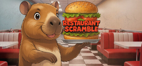
Restaurant Scramble scored 75/100 on Steam Analyzer — Good for a Casual capsule. Top priority fix: [contrast_color] Increase background contrast by darkening diner interior shadows or adding a bright accent wall section to push the hamster and burger forward visually.

Capsule scores by dimension

  • Genre Clarity: 8/10 — Clear management game visual. The anthropomorphic hamster character holding a burger in a diner setting immediately communicates casual management gameplay. At TINY size, the burger and restaurant booth environment remain recognizable, clearly signaling a restaurant/business sim genre. The cartoony art style and bright diner aesthetic reinforce the lighthearted casual positioning.
  • Title Readability: 8/10 — Bold, legible title placement. The red 'RESTAURANT SCRAMBLE' text overlays the burger with strong black outline, ensuring readability at FULL and SMALL sizes. At TINY size, the title remains identifiable despite compression, though individual letterforms blur slightly. Strategic positioning on the burger element rather than noisy background preserves legibility across all viewing conditions.
  • Contrast & Color: 7/10 — Good value separation overall. The warm tan hamster and golden burger pop moderately against the muted diner interior with its pale walls and red booths. At TINY size, the character and food maintain reasonable silhouette clarity against the background. The red title text creates adequate contrast, though the overall palette leans warm and mid-tone without extreme light-dark separation in grayscale.
  • Uniqueness & Polish: 7/10 — Charming character-driven design. The distinctive hamster protagonist with expressive eyes and friendly demeanor creates memorable brand identity beyond generic restaurant sim visuals. The 3D-rendered character and burger show competent craft and polish. However, the diner interior composition is fairly standard restaurant game fare, and the overall concept leans on familiar casual game tropes rather than a novel hook.
  • Brand Consistency: 7/10 — Cohesive character-centric brand. The hamster mascot serves as a clear, recognizable identity anchor that should carry across store screens and marketing materials. The warm, friendly art direction and pastel diner palette create internal cohesion. The rendered 3D style is consistent throughout visible elements, establishing a unified visual language, though without extreme distinctiveness compared to other indie management games.
  • Composition: 8/10 — Strong focal hierarchy and balance. The hamster character naturally anchors the left-center composition with the burger as the secondary focal point, creating clear visual hierarchy. The diner booths frame the scene without overwhelming, and the layout maintains good negative space. At SMALL and TINY sizes, the character and burger read clearly as the primary subjects, with booth details fading appropriately into supporting role.

What works

  • Memorable mascot character. The expressive hamster with distinctive eyes and friendly smile creates immediate recognition and emotional appeal that elevates the capsule beyond generic restaurant sim imagery.
  • Legible title treatment. Red text with black outline on the burger background maintains readability from FULL down to TINY size without collapsing into illegibility.
  • Clear genre communication. Diner setting, burger presentation, and character pose instantly signal casual management gameplay without ambiguity.
  • Cohesive color palette. Warm tans, reds, and creams create a unified aesthetic that feels intentional and thematic to the restaurant concept.

What hurts the capsule

  • Limited contrast separation. The warm brown hamster and golden burger blend somewhat into the beige diner walls, reducing silhouette pop at TINY size in grayscale view.
  • Generic diner interior. The booth-and-checkered-floor setting is a familiar casual game visual that doesn't establish distinctive brand identity beyond the hamster character itself.
  • Muted overall value range. The composition skews toward mid-tone warmth without strong highlight or shadow anchors to create visual drama or emphasis.

Priority fixes

  1. [contrast_color] Increase background contrast by darkening diner interior shadows or adding a bright accent wall section to push the hamster and burger forward visually.
  2. [composition] Ensure critical character and burger elements stay well within safe margins if Steam applies any edge cropping at small carousel sizes.
  3. [uniqueness_polish] Consider adding a subtle signature visual element or UI detail (e.g., a hamster-branded sign or menu item) that reinforces brand identity beyond the mascot alone.

Store copy priority fixes

  1. [hook_strength] Rewrite the short description to lead with capybaras and the playful tone: "Run a capybara-filled diner in this charming incremental where menu variety and customer happiness drive your profits." This moves the differentiator to the front.
  2. [audience_targeting] Add a sentence to the opening or a new section emphasizing accessibility: "Perfect for casual players—play at your own pace with no time pressure, save anytime, and enjoy a relaxing progression experience."
  3. [uniqueness] In the "Meet new customers" section, emphasize why customer variety matters: "Unlike standard incrementals, each customer type introduces cascading effects that fundamentally change your strategy, making no two runs feel identical."
  4. [tone_match] Rewrite section headers in a warmer, more conversational voice (e.g., "Keeping Your Menu Fresh" instead of "Update your menu") to better match the game's relaxing, charming personality.

Related guides

Steam app ID: 3906780 · Tags: Casual, Idler, Incremental, Strategy, Capybaras