Scoring genre clarity...

Toy Zombies capsule

Toy Zombies

Escape the abandoned mall by hiding from the creatures, learn their behaviors and explore the place to find the way out.

$4.99Positive(16)
Multiple EndingsIndieHorror
Joelías_N1Mar 13, 2026

Toy Zombies scores 63/100 — better than 10% of Multiple Endings capsules (n=1,722).

Positive (16 reviews) · $4.99 · Released Mar 13, 2026 · By Joelías_N1

Quick text summary

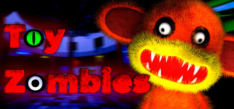
Toy Zombies scored 63/100 on Steam Analyzer — Solid for a Multiple Endings capsule. Top priority fix: [title_readability] Redesign title with single color and bolder outline to maintain legibility at SMALL and TINY sizes; consider white or pure red for maximum contrast.

Capsule scores by dimension

  • Genre Clarity: 7/10 — Action horror indie clearly signaled. The grotesque toy creature with exaggerated teeth and menacing expression immediately communicates action-horror tone. At TINY size the creature silhouette and red coloring still register as threatening, though the mall-exploration and stealth mechanics are not visually hinted. The palette and character design lean distinctly toward creature-focused action rather than strategy.
  • Title Readability: 6/10 — Title readable at full size only. The 'TOY ZOMBIES' text uses bold red and green letters with strong color separation at full size, but at SMALL size the letter details blur together and readability drops noticeably. At TINY size the text becomes difficult to parse as distinct words. The logo placement in the upper left is conventional but the multi-color approach creates some visual noise that doesn't scale cleanly.
  • Contrast & Color: 7/10 — Strong warm tones against dark ground. The orange and yellow creature fur, combined with bright red mouth and vibrant red title text, creates clear value separation from the dark background and blue accent elements. The contrast holds reasonably well at SMALL size due to saturation and luminosity, though some of the yellow mid-tones lack the punch of the reds. In grayscale the creature still reads as a distinct lighter form, though some internal feature definition softens.
  • Uniqueness & Polish: 5/10 — Generic toy-horror without distinctive hook. While the creature design is visually striking with stylized features, it reads as a competent but somewhat generic toy-monster aesthetic without a clear unique selling point that distinguishes it from other indie horror titles. The capsule shows technical craft in rendering but lacks narrative or mechanical visual storytelling that would communicate why this specific game stands out—mall-exploration and stealth mechanics are entirely absent from the visual language. Compared to top-performing peers like DREDGE or Lethal Company which communicate unique mechanics or atmosphere, this feels more surface-level.
  • Brand Consistency: 6/10 — Consistent but generic toy-horror palette. The design establishes a coherent toy-creature theme with consistent orange-red-yellow coloring and playful-yet-menacing character proportions that could theoretically be recognized across marketing materials. However, without sight of the 19 available screenshots, the palette and creature design feel archetypal rather than distinctively branded—the neon blues, reds, and yellows are common in low-poly horror indie games. Internal consistency is competent but not memorable.
  • Composition: 7/10 — Clear focal point with supporting title. The creature dominates the right-center composition with a strong eye-contact focal point that reads clearly at all sizes. The title occupies the left side in traditional placement without competing for primary attention. At TINY size the creature remains the clear visual anchor, and the overall balance avoids clutter, though the blue ribbon or stripe element in the background adds some compositional busywork without narrative purpose.

What works

  • Creature silhouette is strong. The toy zombie has exaggerated, readable proportions and eye contact that creates immediate focal clarity even when scaled down to thumbnail.
  • Value contrast against dark Steam background. Warm orange and yellow tones pop distinctly against the #1b2838 background, ensuring visibility in quick-scroll scenarios.
  • Consistent playful-horror tone. The creature design and title text maintain unified toy-monster aesthetic throughout the composition without tonal confusion.

What hurts the capsule

  • Title text does not scale to TINY. The multi-colored letter approach loses legibility below SMALL size, making the game name difficult to read on scrolling.
  • No mechanic or setting visuals. The capsule shows only a creature; it communicates nothing about the mall-exploration stealth gameplay or what makes this game mechanically distinct.
  • Generic horror-indie visual language. Compared to top-tier peers, the design lacks a signature visual hook, memorable motif, or distinctive art direction that would make this IP recognizable.
  • Background elements distract. The blue ribbon and neon effects add visual complexity without supporting the composition or narrative clarity.

Priority fixes

  1. [title_readability] Redesign title with single color and bolder outline to maintain legibility at SMALL and TINY sizes; consider white or pure red for maximum contrast.
  2. [genre_clarity] Add a subtle environmental cue—silhouette of abandoned mall shelving, security camera, or hiding spot—to hint at the exploration and stealth mechanics without cluttering the creature focal point.
  3. [uniqueness_polish] Introduce a distinctive visual motif or color accent that signals the game's unique hook (e.g., emphasized hiding mechanic, creature behavior learning element) to differentiate from generic toy-horror.
  4. [composition] Simplify background elements; remove or desaturate the blue ribbon to reduce visual noise and let the creature command full attention.

Store copy priority fixes

  1. [uniqueness] Add a sentence that clearly states what makes the creature-avoidance mechanic or mall setting distinct—e.g., 'Each creature reacts to your behavior in unpredictable ways' or 'Master entirely new AI patterns every playthrough to survive.'
  2. [feature_communication] Restructure the detailed description to lead with a bulleted or clearly separated 'Core Mechanics' section that lists: Learn Creature Behavior, Stealth & Distraction, Puzzle Unlocking, Exploration Across 5+ Zones.
  3. [audience_targeting] Add a sentence clarifying intended playstyle and difficulty tone, e.g., 'A puzzle-focused survival-horror game for players who prefer strategy and stealth over combat,' to set expectations.
  4. [tone_match] Remove or reframe the 'AniMall's Shopping! We offer a wide variety of services' paragraph to maintain horror atmosphere; e.g., describe the mall as 'once a bustling shopping center, now a decaying labyrinth' instead.

Related guides

Steam app ID: 3907280 · Tags: Multiple Endings, Indie, Horror, First-Person, Open World