Scoring genre clarity...

Micro Mages Maker capsule

Micro Mages Maker

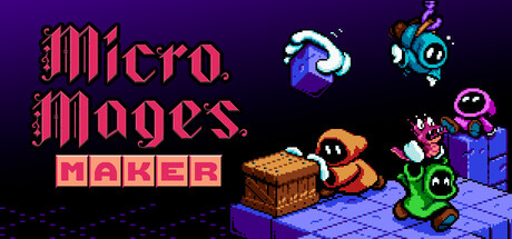
Micro Mages Maker is a level editor of Micro Mages, a platform game developed for the 8-bit console. Create your own levels, share them with everyone! Contains new levels to play solo or with up to 4 players simultaneously! Includes the original Micro Mages and Micro Mages Second Quest.

$15.49Positive(12)
2D PlatformerActionAdventure
Morphcat Games, Novasplore GamesApr 2, 2026

Micro Mages Maker scores 77/100 — better than 79% of 2D Platformer capsules (n=1,970).

Positive (12 reviews) · $15.49 · Released Apr 2, 2026 · By Morphcat Games

Quick text summary

Micro Mages Maker scored 77/100 on Steam Analyzer — Good for a 2D Platformer capsule. Top priority fix: [title_readability] Add a thin dark outline or shadow to the 'MICRO MAGES' and 'MAKER' text to improve legibility at small and tiny sizes while preserving the gothic style.

Capsule scores by dimension

  • Genre Clarity: 8/10 — Retro platformer with level editor. The pixel art characters, isometric grid floor, treasure chest, and colorful sprite elements immediately signal a retro action-platformer with creative customization tools. At tiny size, the distinct character silhouettes and iconic chest remain readable, though genre specificity becomes less obvious without the 'MAKER' text context.
  • Title Readability: 7/10 — Clear but multi-line layout. The pink gothic-style 'Micro Mages.' text is legible at full size with good contrast against the dark purple background, and the pink 'MAKER' box reinforces the product focus. At small size the stacked lines remain readable, but at tiny size the font style begins to blur and the 'MAKER' subtitle becomes a solid block rather than individual letters.
  • Contrast & Color: 8/10 — Strong value separation. Bright pink title, cyan and orange character sprites, and vibrant purples create clear separation against the dark purple background with good saturation control. The isometric floor grid and character silhouettes maintain definition even in grayscale due to strong light-to-dark transitions, and all key elements remain distinct at small size.
  • Uniqueness & Polish: 7/10 — Polished retro aesthetic. The pixel art execution is clean and cohesive with authentic 8-bit NES-era visual language, and the arrangement of multiple colorful characters with the treasure chest communicates the level-building and cooperative play hook. The gothic title font adds personality, though the overall scene remains somewhat familiar to other retro platformer capsules without a truly distinctive visual hook.
  • Brand Consistency: 8/10 — Consistent retro platformer identity. The pixel art style, color palette (purples, pinks, cyans, oranges), and character designs align with authentic 8-bit platformer branding and suggest a recognizable visual identity across the series. The presence of multiple colorful mage characters and the magical elements (wands, orbs) create a memorable motif that distinguishes it within the retro genre.
  • Composition: 8/10 — Balanced layout with clear focal point. The title anchors the top-left in a controlled region, while the character group in the center-right creates the primary focal point with the treasure chest adding secondary interest and depth layering between foreground sprites and background grid. At small and tiny sizes the right-side character cluster remains the dominant visual anchor, though there is some empty blue space on the left that could feel slightly imbalanced.

What works

  • Authentic retro pixel art. Clean, colorful sprite work with strong silhouettes and recognizable character designs that read distinctly even at tiny size.
  • Strong color contrast. Pink and bright accent colors pop clearly against dark purple background with excellent value separation in both color and grayscale.
  • Cohesive visual identity. Unified palette and pixel art style create a memorable brand feel consistent with 8-bit platformer expectations.
  • Composition hierarchy. Clear focal point with character group and treasure chest supported by anchored title and background grid depth.

What hurts the capsule

  • Title readability at tiny size. The decorative pink font begins to blur and loses letter clarity below small size, and the stacked 'MICRO MAGES' / 'MAKER' layout becomes harder to parse as distinct words.
  • Generic scene composition. While well-executed, the arrangement of sprites and environment feels familiar to typical retro platformer capsules without a unique layout or unexpected visual element.
  • Underutilized left side space. Significant empty blue area on the left side of the composition creates mild imbalance and leaves prime real estate unused.

Priority fixes

  1. [title_readability] Add a thin dark outline or shadow to the 'MICRO MAGES' and 'MAKER' text to improve legibility at small and tiny sizes while preserving the gothic style.
  2. [composition] Shift or expand the character group slightly left and add a secondary visual element (magical effect, additional prop, or UI hint) to the left side to better balance the layout and fill empty space.
  3. [uniqueness_polish] Consider adding a subtle distinctive visual hook such as a unique magical aura, particle effect, or character pose that signals the 'Maker' tool aspect more directly.

Store copy priority fixes

  1. [hook_strength] Rewrite the short description to lead with the creative appeal: 'Design evil towers, trap your friends, and become the dark lord of your own platformer—then share your creations with the world.'
  2. [feature_communication] Add a brief sentence describing the level editor interface and what players can actually customize (e.g., 'Paint floors and walls, place enemies and hazards, set spawn points, and test instantly').
  3. [uniqueness] Insert a sentence that differentiates the editor from other platformer makers, such as a unique feature, aesthetic advantage, or ease-of-use claim specific to Micro Mages Maker.

Related guides

Steam app ID: 3907760 · Tags: 2D Platformer, Action, Adventure, Level Editor, Singleplayer