Scoring genre clarity...
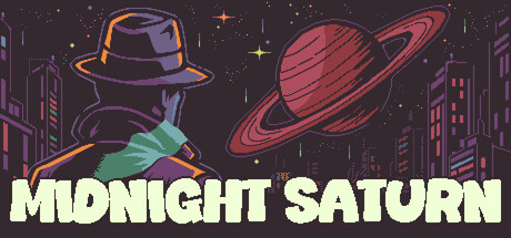
A grizzled private eye in a sci-fi adventure takes a murder case no one else will touch. He’s seen it all before, but nothing’s prepared him for a conspiracy that leads off-world. Something big is about to happen. Whatever it is... it goes live at midnight.
$9.99Positive(27)
AdventurePixel GraphicsPoint & Click
Cosmic VoidMay 5, 2026