Death Hive scores 73/100 — better than 58% of Action capsules (n=8,534).

Quick text summary

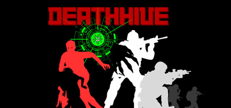
Death Hive scored 73/100 on Steam Analyzer — Good for a Action capsule. Top priority fix: [uniqueness_polish] Introduce a signature visual element such as a distinctive character silhouette, zombie-specific design detail, or environmental context (burnt building outline, neon signage) that differentiates Death Hive from generic action shooters.

Capsule scores by dimension

  • Genre Clarity: 8/10 — Clear action shooter identity. The red silhouetted figures in combat poses with visible weapons, green circular reticle/target UI element, and dynamic stance suggest top-down action shooter mechanics immediately. At tiny size, the silhouettes and green HUD element still read as action-oriented gameplay. The zombie/infected aesthetic is implied through the grotesque figure poses and color scheme rather than explicit creature detail.
  • Title Readability: 9/10 — Bold, high-contrast title. DEATHWIVE is rendered in thick, blocky red capital letters against pure black background with excellent contrast and zero ambiguity at full, small, and tiny sizes. The title placement at top center with ample breathing room and no competing elements ensures it remains the dominant text element even at extreme reduction. Letterforms are clean and architectural, maintaining perfect legibility throughout all viewport sizes.
  • Contrast & Color: 8/10 — Strong value separation. Red figures against black background and white/gray figures against black create clear silhouettes with excellent value separation that reads well at tiny size. The bright green circular reticle in the upper center provides a secondary accent that breaks monotony. In grayscale, the composition maintains clear edge definition and subject separation, though the mid-tone gray figures lose slightly more definition than the pure red and white elements.
  • Uniqueness & Polish: 6/10 — Competent but generic action. The layout follows familiar action game conventions with dynamic figure poses and a glowing HUD element, but lacks a distinctive hook or memorable visual signature that would set it apart in a crowded indie shooter space. The color palette and silhouette approach are clean and professional, but don't communicate a unique selling point or mechanic. Compared to top-tier indie capsules like Lethal Company or DREDGE, this reads as solid execution of standard action game iconography.
  • Brand Consistency: 6/10 — Functional but underdeveloped identity. The red/white/black color palette and geometric UI reticle appear consistent with action game branding, but without access to internal store screenshots, the capsule does not project a distinctly memorable identity that would be recognized across different marketing contexts. The figures and reticle lack iconic character design or signature visual motif that would anchor brand recall. The style is coherent but generic enough that it could belong to multiple similar games.
  • Composition: 7/10 — Clear hierarchy, minor spacing. Title dominates the top with strong visual weight, while figures create a clear layered composition from red (foreground left) through white (mid-ground center) to gray (background right), establishing depth and focal hierarchy. At small and tiny sizes, the composition reads cleanly with the central figures holding attention. The right edge figures extend close to the boundary, which at extreme crop could lose some secondary silhouette detail, and there is some empty space in the upper-right that could be tighter.

What works

  • Legible title at all sizes. Bold red blocky letters maintain perfect readability from full resolution down to tiny thumbnail, with strong contrast against pure black background ensuring no loss of clarity at extreme reduction.
  • Clear action genre signals. Dynamic combat poses, weapon silhouettes, and green HUD reticle immediately communicate top-down action shooter gameplay even at glance speeds.
  • Effective silhouette layering. Red foreground, white midground, and gray background figures create visual depth and guide the eye across the composition without clutter.

What hurts the capsule

  • Generic visual identity. The red/white/black silhouette approach and circular reticle feel like standard action game tropes without a distinctive hook that differentiates Death Hive from other indie shooters.
  • Limited color palette storytelling. While clean, the black background and monochromatic figures don't suggest the 'abandoned city' setting or 'zombie' theme as effectively as thematic environmental context or creature-specific visual design would.
  • Undefined brand signature. No iconic character, symbol, or visual motif anchors brand recognition or communicates what makes Death Hive distinctly memorable compared to peers like Helldivers 2 or Lethal Company.

Priority fixes

  1. [uniqueness_polish] Introduce a signature visual element such as a distinctive character silhouette, zombie-specific design detail, or environmental context (burnt building outline, neon signage) that differentiates Death Hive from generic action shooters.
  2. [genre_clarity] Add subtle environmental storytelling cues like abandoned urban decay, radiation effects, or creature-specific details that reinforce the 'zombie shooter in abandoned city' pitch.
  3. [brand_consistency] Establish an iconic motif or palette variation (e.g., toxic green accents, fractured glass effects, specific reticle design) that becomes instantly recognizable as Death Hive across marketing materials.

Store copy priority fixes

  1. [hook_strength] Replace 'The outbreak has begun' with a specific, evocative hook that signals what is unique about Death Hive's survival challenge—e.g., 'Survive the cold and the infected in an abandoned megacity where every fire is a lifeline and every merchant trade matters.'
  2. [uniqueness] Add a 2-3 sentence paragraph highlighting what differentiates Death Hive: explain how the Merchant trading system, environmental survival (fire mechanic), or boss variety sets it apart from other zombie shooters, or position it as a specific subgenre blend (arcade roguelike vs narrative survival).
  3. [feature_communication] Expand the 'Engaging boss fights' line to describe one or two specific boss mechanics or examples (e.g., 'bosses with distinct attack patterns that require adaptive tactics') so players understand what to expect.
  4. [tone_match] Rewrite the Early Access section to match the narrative tone of the opening paragraphs, framing upcoming features as extensions of the survival story (e.g., 'Survivors will unlock new missions and safe houses') rather than a clinical feature checklist.

Related guides

Steam app ID: 3910110 · Tags: Action, Casual, Shooter, Arcade, Action Roguelike