Scoring genre clarity...
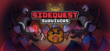
Sidequest Survivors is a bullet-heaven roguelite where you control wacky characters, mow down waves of magical creatures, and tackle sidequests. Choose from a variety of weapons and create builds that match your playstyle.
$9.993 user reviews
Bullet HeavenAction RoguelikeIndie
Level One QuestNov 25, 2025