Quick text summary
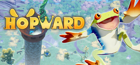
Hopward scored 78/100 on Steam Analyzer — Good for a Adventure capsule. Top priority fix: [uniqueness_polish] Introduce a distinctive visual hook or silhouette element that differentiates Hopward from other pastel indie platformers (e.g., unique frog design feature, signature mechanic visualization)
Capsule scores by dimension
- Genre Clarity: 8/10 — Cheerful platformer with clear action focus. The cheerful frog character with exaggerated smile and dynamic pose immediately signals a casual platformer or action-adventure game. At TINY size, the bright frog silhouette and upward-climbing composition clearly convey movement and progression-based gameplay. The whimsical art style and vibrant pastel environment reinforce indie casual adventure positioning without ambiguity.
- Title Readability: 9/10 — Bold, clear, highly legible at all sizes. The golden-yellow 'HOPWARD' title with thick outlines and capital letterforms maintains excellent readability from full header down to TINY thumbnail. The font sits on a semi-transparent darker background region that isolates it from the busy scenic backdrop. At TINY size, the chunky letterforms and warm yellow-gold color remain distinct and parseable without blur or collapse.
- Contrast & Color: 8/10 — Strong value separation with vibrant warm tones. The bright pastel background (purples, blues, greens, yellows) contrasts well against the Steam dark background #1b2838, and the warm golden title pops distinctly. The red-mouthed frog character has strong silhouette definition with high-saturation local colors that read clearly even when squinting. Grayscale test shows the frog's darker body and bright background maintain solid value separation.
- Uniqueness & Polish: 7/10 — Polished and charming but somewhat familiar style. The capsule features clean, professional 3D rendering with a distinctive whimsical art direction that matches the game's playful tone and subject matter. The smiling frog character and pastel environment are well-crafted and appeal to the indie casual audience, though the overall aesthetic follows established indie platformer visual conventions seen in similar titles. The composition and character design are intentional and non-generic, earning solid marks for craft.
- Brand Consistency: 7/10 — Consistent frog character and cohesive art world. The cheerful frog with distinctive red mouth and yellow ear-like features serves as a strong recognizable character icon that anchors brand identity. The pastel color palette, whimsical 3D art style, and floating platform environments appear consistent with the game's core visual identity across visible elements. The character-forward approach provides memorable branding, though without access to all 9 screenshots, internal consistency confirmation is limited to strong visual cohesion here.
- Composition: 8/10 — Well-balanced with clear focal point hierarchy. The frog character occupies the center-right prime real estate as the dominant focal point, with the title anchored top-left in the safe zone. The floating tower and surrounding environment create depth layering that frames rather than competes with the character. At SMALL and TINY sizes, the large frog maintains clear primary focus while the title remains legible, and the composition shows no dangerous edge-hugging or critical element cropping risk.
What works
- Title remains crisp at thumbnail. The golden HOPWARD text maintains excellent letterform clarity and color pop even when scaled down to 120×45 pixels.
- Strong character silhouette clarity. The frog's distinctive shape, smile, and color saturation ensure it reads as the primary subject across all viewing sizes without ambiguity.
- Effective color pop on dark background. The warm pastels and golden title create excellent value contrast against Steam's dark #1b2838 background, supporting visibility during quick scrolls.
- Cohesive whimsical visual identity. The consistent pastel palette, 3D rendering style, and playful character design create a unified, recognizable brand presence.
What hurts the capsule
- Generic indie platformer aesthetic. While well-executed, the pastel 3D art style and cheerful frog hero align closely with established indie casual game conventions, reducing distinctive memorability.
- Busy background at full size. The dense floating platform environment and scattered visual elements create some compositional noise that could overshadow the title at full header resolution.
Priority fixes
- [uniqueness_polish] Introduce a distinctive visual hook or silhouette element that differentiates Hopward from other pastel indie platformers (e.g., unique frog design feature, signature mechanic visualization)
- [composition] Reduce background visual density in the upper-left quadrant to provide additional breathing room for the title and strengthen visual hierarchy
Store copy priority fixes
- [feature_communication] Add one sentence explaining how autosaves are earned or what triggers checkpoint placement, so players understand the progression philosophy.
- [uniqueness] Rewrite the unique selling point section to explicitly compare or differentiate against similar precision platformers (e.g., 'Unlike X, Hopward's charge-jump mechanic rewards...' or 'The only vertical platformer where Y defines movement').
- [feature_communication] Clarify the mid-air dive mechanic in one sentence: when it's used, what it does (dodge, extend range, change direction?), and why it matters to the climb strategy.
- [audience_targeting] Add a brief signal about intended skill level (e.g., 'for players who love Celeste-style challenges' or 'hardcore platformer fans only') to filter expectations early.
Related guides
Steam app ID: 3910510 · Tags: Adventure, Casual, Platformer, Puzzle Platformer, 3D Platformer