Scoring genre clarity...
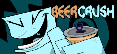
Enter the world of John Beer in this psychotic, fast-paced roguelike where you drink beer to stay alive! Dash as fast as you can through unique and crazy worlds to break the vicious cycle. So what are you waiting for!? LIVE LIFE. EVERY GOLDEN MINUTE OF IT!
$4.99Very Positive(23)
Action RoguelikeFirst-PersonRunner
LOWLIGHTNov 20, 2025