Scoring genre clarity...
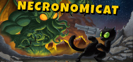
Lovecraft’s cat is done being a cheap joke. After being branded with a hateful name, you’re out for blood. Wield the Necronomicon to shred through Lovecraft’s famous monsters, collect dope loot, and vanquish your racist master. JUST DON'T SAY HIS NAME!
$4.999 user reviews
LovecraftianJRPGRPG
GROOVY GORY GAMESAug 22, 2025