Scoring genre clarity...

Arctic Digger TCG Collection Prologue capsule

Arctic Digger TCG Collection Prologue

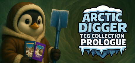
This limited version offers a taste of the full game. A cozy simulation sneak peek where you start digging through the arctic to discover ores and trading card packs. Try out early item production, basic upgrades, and meet your first penguin helpers. More features will come in the full version!

Free to PlayMostly Positive(26)
SimulationTrading Card GameSnow
ToD Game StudioNov 30, 2025

Arctic Digger TCG Collection Prologue scores 75/100 — better than 62% of Simulation capsules (n=5,188).

Mostly Positive (26 reviews) · Free to Play · Released Nov 30, 2025 · By ToD Game Studio

Quick text summary

Arctic Digger TCG Collection Prologue scored 75/100 on Steam Analyzer — Good for a Simulation capsule. Top priority fix: [title_readability] Simplify or remove the 'PROLOGUE' tagline or increase its size and contrast so it remains readable at thumbnail scale without competing with the main title.

Capsule scores by dimension

  • Genre Clarity: 8/10 — Clear cozy sim with TCG hook. The capsule immediately communicates a cozy simulation game through the charming penguin character in warm tones, visible trading cards in hand, and a shovel tool—all genre-specific visual cues. At tiny size, the penguin silhouette and card imagery remain recognizable, though the TCG Collection aspect is less obvious without readable text. The arctic setting and relaxed character pose reinforce the cozy simulation identity clearly.
  • Title Readability: 7/10 — Bold title readable at small size. The title 'ARCTIC DIGGER TCG COLLECTION PROLOGUE' uses white caps with a blue icy outline effect that maintains legibility down to small sizes. At tiny size, the main title reads clearly but the 'PROLOGUE' tagline becomes soft and less distinct. The placement in the upper right on controlled background space helps preserve readability across scales.
  • Contrast & Color: 8/10 — Strong warm-cool contrast separation. The warm golden-brown penguin and item cards contrast sharply against the dark forest-green background, creating excellent silhouette clarity and value separation. The white title with blue icy outline pops well at all sizes against the dark field. Even in grayscale, the character and title elements maintain strong edge definition and remain clearly separated from the background.
  • Uniqueness & Polish: 7/10 — Charming character-driven presentation. The capsule stands out through the distinctive penguin character with personality and visible cozy simulation props (cards, shovel, items) rather than relying on generic game imagery. The art style is polished and cohesive with warm lighting and intentional character staging. However, the overall concept of a cute helper character with tools is somewhat familiar within the indie simulation space, preventing a higher score.
  • Brand Consistency: 7/10 — Consistent cozy Arctic aesthetic. The warm penguin character, ice-textured title font, trading cards, and arctic color palette create a coherent internal identity that would be recognizable across marketing. The character's pose and styling suggest a friendly, approachable brand personality consistent with cozy sims. The visual language is internally consistent, though without seeing other store assets, we cannot verify full brand continuity against the 7 available screenshots.
  • Composition: 8/10 — Well-balanced focal hierarchy. The penguin character anchors the left-center as the primary focal point with clear depth layering—penguin in foreground, cards and shovel as supporting mid-elements, and gradient background creating separation. The title in the upper right complements without competing. At tiny size the composition remains readable with the character as the dominant visual anchor and the text clearly secondary.

What works

  • Distinctive character-driven focal point. The charming penguin with visible personality and cozy props creates immediate visual interest and communicates the game's tone without relying on text.
  • Strong contrast against dark background. Warm golden tones and white title text separate cleanly from the dark forest-green, ensuring excellent legibility and pop at all viewing sizes.
  • Clear genre communication via props. The visible shovel, trading cards, and arctic setting immediately signal a cozy simulation with TCG mechanics through visual storytelling alone.

What hurts the capsule

  • Tagline illegibility at tiny size. The 'PROLOGUE' subtitle becomes soft and difficult to read at thumbnail scale, reducing clarity of the 'limited early access' message.
  • Generic cozy simulation archetype. While well-executed, the cute helper character with tools is a familiar trope in indie sims, limiting distinctiveness within the crowded genre.
  • Limited visual storytelling depth. The capsule shows what the character has but not what the player will experience or achieve, missing an opportunity to hint at progression or core mechanics.

Priority fixes

  1. [title_readability] Simplify or remove the 'PROLOGUE' tagline or increase its size and contrast so it remains readable at thumbnail scale without competing with the main title.
  2. [uniqueness_polish] Add a subtle visual hook that hints at the core gameplay loop (e.g., ore fragments, excavation result, card discovery) to differentiate from generic cozy sim archetypes.
  3. [composition] Ensure title safe margins are maintained if Steam applies horizontal cropping, or consider slightly shifting the title box left to increase padding from the right edge.

Store copy priority fixes

  1. [hook_strength] Replace 'This limited version offers a taste of the full game' with a gameplay-forward hook like 'Dig through Arctic ice, unearth hidden card packs, and build a penguin-powered workshop' to lead with action and charm rather than product positioning.
  2. [uniqueness] Add a sentence after the opening that explicitly differentiates the game: for example, 'Combine mining progression with a fully playable TCG mechanic where cards directly boost your digging power and earnings' or 'The only game where your trading card collection physically improves your mining operation.'
  3. [feature_communication] Expand on the 'upgrade' mechanic in the second section by naming one or two specific examples: 'Upgrade your pickaxe for deeper mining' or 'Unlock faster crafting machines to scale production' so players understand progression feels tangible.
  4. [audience_targeting] Add one sentence after the short description that signals the intended player: for example, 'Perfect for players who enjoy relaxing incremental progress, collection completion, and building up a thriving operation at their own pace.'

Related guides

Steam app ID: 3914720 · Tags: Simulation, Trading Card Game, Snow, Mining, Exploration