Scoring genre clarity...

Project Cobalt capsule

Project Cobalt

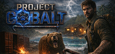
⚗️ Project Cobalt is a survival action game set on a hostile island 🌴. Scavenge containers, mine resources, craft tools, hunt animals, and endure storms as you fight hunger, disease, and exhaustion all while uncovering the dark truth behind a failed experiment.

$10.99Mixed(35)
Early AccessSurvivalOpen World
OxygenStudioAug 18, 2025

Project Cobalt scores 72/100 — better than 42% of Early Access capsules (n=3,067).

Mixed (35 reviews) · $10.99 · Released Aug 18, 2025 · By OxygenStudio

Quick text summary

Project Cobalt scored 72/100 on Steam Analyzer — Good for a Early Access capsule. Top priority fix: [uniqueness_polish] Introduce a signature visual element—such as a crafting interface hint, unique island mutation visual, or distinctive equipment detail—that communicates the core survival-craft mechanic and differentiates from generic survival-action games.

Capsule scores by dimension

  • Genre Clarity: 7/10 — Survival action clearly signaled. The capsule immediately communicates action-adventure survival through multiple cues: a aggressive bear mid-snarl in the center, a weathered male protagonist with tactical gear, stormy atmospheric backdrop, and tropical island setting with burning structures. At tiny size, the bear silhouette and armed character remain the dominant visual hierarchy, establishing survival-action identity without ambiguity.
  • Title Readability: 8/10 — Strong logo with good contrast. PROJECT COBALT uses a metallic blue and gray color palette with a tech-styled font positioned prominently in the upper-left quadrant against controlled sky background, making it readable at full and small sizes. The logo maintains clarity even at tiny size due to bold letterforms and the distinctive blue hexagon design element, though fine detail of the logo mark softens slightly at smallest view.
  • Contrast & Color: 8/10 — Excellent value separation overall. The image leverages warm oranges and yellows from fire/lighting against cool blues of sky and ocean, creating strong visual separation against Steam's dark background. The protagonist and bear silhouettes read distinctly due to mid-tone brown positioning against darker storm clouds and bright fire elements, and grayscale test confirms strong value differentiation throughout composition.
  • Uniqueness & Polish: 7/10 — Premium execution with familiar beats. The capsule demonstrates solid craft with professional lighting, coherent grading, and layered atmosphere including storm effects and fire. However, the 'stranded survivor vs dangerous beast' visual is a well-established AAA action-game trope, and the execution, while competent, does not communicate a distinctive mechanical hook or unique selling point that would elevate it beyond genre expectations.
  • Brand Consistency: 6/10 — Cohesive but not immediately iconic. The image maintains internal consistency with warm survival-horror color palette, gritty weathered character design, and naturalistic rendering style that likely aligns with in-game visuals. However, there are no signature visual motifs, distinctive brand symbols, or immediately memorable identity cues that would be recognizable as 'Project Cobalt' versus other survival-action games without the logo.
  • Composition: 7/10 — Clear focal point with solid balance. The bear command strong center attention with the protagonist positioned to the right, creating dynamic asymmetric balance. Title placement in upper-left respects safe margins and does not compete for focus. At small and tiny sizes, the bear-human conflict remains the unmistakable primary subject; however, the background building adds complexity that slightly fragments secondary attention without clear narrative hierarchy.

What works

  • Bold atmospheric lighting. Warm fire and cool storm lighting creates strong visual drama and immediate mood that reads clearly even at tiny thumbnail size.
  • Readable logo placement. Metallic blue PROJECT COBALT title avoids character overlap and maintains legibility across all viewing sizes with confident letterforms.
  • Strong silhouette contrast. Bear and protagonist figures maintain distinct outlines against background elements, ensuring genre identity survives at smallest scales.

What hurts the capsule

  • Generic survival-action trope. The 'stranded fighter vs apex predator on hostile island' visual concept is heavily repeated in AAA action games, limiting uniqueness perception.
  • Secondary element distraction. The burning structure in background mid-right competes visually with bear-protagonist core conflict, slightly fragmenting compositional focus.
  • No distinctive brand visual hook. The capsule lacks a signature symbol, unique color treatment, or mechanical storytelling element that would make this recognizable as Project Cobalt specifically.

Priority fixes

  1. [uniqueness_polish] Introduce a signature visual element—such as a crafting interface hint, unique island mutation visual, or distinctive equipment detail—that communicates the core survival-craft mechanic and differentiates from generic survival-action games.
  2. [composition] Reduce background building prominence by darkening or softening it to strengthen focus on bear-protagonist confrontation as the singular visual anchor.
  3. [brand_consistency] Develop a recognizable color or symbol motif (crafting-related icon, experiment lab mark, or unique resource visual) that appears consistently across marketing materials to build brand recall.

Store copy priority fixes

  1. [uniqueness] Add a specific, concrete differentiator—e.g., 'the only survival game where your choices in crafting and trading directly alter the island's ecosystem' or a unique mechanic that sets it apart from Rust, Stranded Deep, or The Forest.
  2. [hook_strength] Move 'Scavenge containers, mine resources, craft tools, hunt animals' to the first sentence of the detailed description to lead with action, then follow with the narrative frame to avoid burying the gameplay hook.
  3. [tone_match] Reduce emoji frequency by 50% or group them into a visual header only; preserve the dark, tense tone of the survival narrative without cutesy decoration that undermines the premise.
  4. [feature_communication] Add one sentence under the short description or in Key Features that explains how the 'dark truth' narrative is revealed during gameplay—e.g., 'Uncover the experiment's secrets through environmental clues and NPC encounters as you survive.'

Related guides

Steam app ID: 3916570 · Tags: Early Access, Survival, Open World, Crafting, Resource Management