Quick text summary
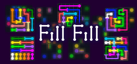
Fill Fill scored 72/100 on Steam Analyzer — Good for a Casual capsule. Top priority fix: [genre_clarity] Introduce a signature character or mascot element to clarify the specific puzzle mechanic (pipe filling, block placing, etc.) and strengthen genre communication at TINY sizes.
Capsule scores by dimension
- Genre Clarity: 7/10 — Neon puzzle game identity clear. The bright neon pipe and block motifs immediately signal a puzzle or wire-connection game, with the colorful geometric abstract elements reinforcing a casual indie aesthetic. At TINY size, the neon pipes and bouncing dots remain readable enough to suggest puzzle mechanics, though specific game mechanics become less apparent due to the abstract presentation.
- Title Readability: 8/10 — Clean centered white title. The 'Fill Fill' title uses clean, bold white sans-serif lettering centered on a dark purple background with strong contrast and clear letterforms. The title remains legible at SMALL and TINY sizes due to solid weight and lack of decorative elements, though the duplicate word structure could be clearer at smallest sizes.
- Contrast & Color: 8/10 — Strong neon pop against dark ground. Vibrant neon magenta, cyan, yellow, and green pipe elements create excellent separation against the dark purple background, with high saturation and value contrast that persists across all sizes. The white title pops clearly even at TINY size, and the colorful geometric elements maintain their visual punch in grayscale due to strong value differences.
- Uniqueness & Polish: 7/10 — Stylish neon aesthetic, somewhat familiar. The neon pipe puzzle aesthetic feels polished and cohesive with intentional color choices and glowing effects that suggest quality craft. However, neon puzzle game visuals are a recognizable indie trope, and the design lacks a distinctive character, mascot, or unique narrative hook that would elevate it above competent genre execution.
- Brand Consistency: 6/10 — Consistent neon style, limited identity. The neon color palette and geometric pipe motifs are internally cohesive and suggest a recognizable visual direction for the game. However, without character elements, iconic symbols, or distinctive visual signatures beyond the standard neon aesthetic, the brand lacks memorable identity cues that would differentiate it from other neon puzzle games.
- Composition: 7/10 — Balanced layout, clear focal hierarchy. The centered 'Fill Fill' title creates a strong primary focal point with neon pipe elements distributed around it as supporting visual interest, avoiding clutter while maintaining visual balance. The composition reads well at SMALL size with good spacing, though at TINY size the distributed pipe elements become a busy background texture that may reduce legibility slightly.
What works
- Excellent color contrast against Steam dark background. The neon palette of magenta, cyan, yellow, and green creates vibrant separation that immediately catches the eye and sustains readability at thumbnail sizes.
- Strong title legibility with clean typography. Bold white sans-serif centered placement ensures the game name remains crystal clear even at TINY size with no competing text or decorative complications.
- Cohesive visual direction and polish. The neon pipe aesthetic feels intentional and well-executed with consistent glowing effects and color saturation throughout the composition.
What hurts the capsule
- Generic neon puzzle game aesthetic. The visual style relies on familiar neon+pipes tropes that are common in indie puzzle games, offering limited distinctiveness or unique visual storytelling.
- Lack of character or memorable brand symbols. The capsule contains no iconic mascot, character, motif, or visual signature that would create lasting brand recognition beyond the neon theme.
- Busy background texture at TINY size. The distributed neon pipe elements around the edges create visual noise at smallest sizes that may reduce immediate clarity compared to a more focused design.
Priority fixes
- [genre_clarity] Introduce a signature character or mascot element to clarify the specific puzzle mechanic (pipe filling, block placing, etc.) and strengthen genre communication at TINY sizes.
- [uniqueness_polish] Add a distinctive visual hook such as a unique art style element, character, or thematic symbol that differentiates this from generic neon puzzle games.
- [brand_consistency] Develop a recognizable brand identity element or color motif that could appear across future marketing materials and game assets for consistency.
Store copy priority fixes
- [hook_strength] Replace the short description with a verb-forward hook that leads with the unique mechanic: e.g., 'Connect dots to paint the board—but items change color and bridges twist the puzzle. A minimalist logic challenge that gets harder every level.'
- [uniqueness] Explicitly explain what the 'new mechanic' is: add a sentence such as 'Unlike standard flow games, color-shifting items force you to rethink your path mid-puzzle, and bridges add spatial constraints that transform simple connects into layered logic challenges.'
- [feature_communication] Expand the features list to explain gameplay depth: add bullets describing level count, puzzle types (e.g., color-change mechanics, bridge types), difficulty modes, and hint system limits so players understand progression and challenge scope.
- [audience_targeting] Add a sentence to the opening that identifies the player: e.g., 'Perfect for puzzle enthusiasts who love logic games without time pressure' or 'Ideal for casual players seeking a relaxing yet brain-engaging experience.'
Related guides
Steam app ID: 3917180 · Tags: Casual, Board Game, Puzzle, 2D, Colorful