Scoring genre clarity...

MAID MOVING BOXES capsule

MAID MOVING BOXES

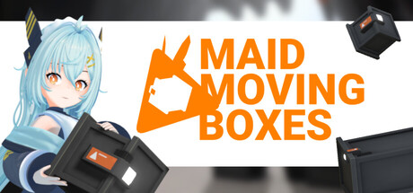
An anime android maid and her work drone are meeting a quota at the warehouse! A simple yet engaging game about the monotonous, relaxing process of working as a mover. Short but challenging levels, multiplayer, and lots and lots of boxes await you!

Free to PlayVery Positive(15)
SimulationCasualRelaxing
PartaevilDec 5, 2025

MAID MOVING BOXES scores 73/100 — better than 51% of Simulation capsules (n=5,188).

Very Positive (15 reviews) · Free to Play · Released Dec 5, 2025 · By Partaevil

Quick text summary

MAID MOVING BOXES scored 73/100 on Steam Analyzer — Good for a Simulation capsule. Top priority fix: [genre_clarity] Emphasize the gameplay loop visually by adding subtle conveyor belt or packing action elements to the warehouse background to better communicate the core simulation mechanic at TINY size.

Capsule scores by dimension

  • Genre Clarity: 7/10 — Casual sim with anime aesthetic. The anime maid character with boxes and warehouse setting clearly signal a casual simulation game about logistics work. At TINY size, the character silhouette and orange box motif remain identifiable, though the specific 'moving' mechanic is less obvious without the title. The android maid aesthetic effectively differentiates it from generic workplace sims.
  • Title Readability: 8/10 — Bold orange text, strong legibility. The title 'MAID MOVING BOXES' uses large, sans-serif orange lettering that maintains excellent contrast against the white background at all sizes. At TINY size, the text remains readable due to substantial letter weight and spacing. The stacked layout efficiently uses the header format without edge-hugging or overflow issues.
  • Contrast & Color: 8/10 — Vibrant orange pops against dark Steam bg. The bright orange title and box icon create strong value separation from the #1b2838 Steam background, ensuring visibility during quick scroll. The character's cool blue-cyan tones and dark outfit provide depth layering and silhouette clarity. In grayscale, the orange converts to a mid-light tone that still distinguishes from both the white and dark elements.
  • Uniqueness & Polish: 7/10 — Distinctive anime charm, solid execution. The anime android maid character with expressive design and the playful orange box logo create a memorable visual hook that stands apart from typical simulation game templates. The craft is clean with coherent rendering, though the overall composition feels somewhat straightforward without surprising visual storytelling elements that hint at gameplay depth or unique mechanics.
  • Brand Consistency: 7/10 — Anime aesthetic with box motif identity. The capsule establishes recognizable identity signals through the anime character design, orange box icon, and warehouse elements. The consistent color palette (orange, blue, black) and clean art style create internal cohesion. Without access to the 9 store screenshots for full cross-material verification, the capsule alone shows good thematic consistency between the character, logo, and setting.
  • Composition: 7/10 — Clear hierarchy, character-driven focus. The composition uses strong left-to-right hierarchy with the character anchoring the left side and the large orange title dominating the right, creating balanced visual weight distribution. At SMALL and TINY sizes, the character remains the clear focal point while the title stays readable and prominent. The floating box elements and drone in the background provide supporting visual interest without competing for attention.

What works

  • Orange title contrast. The vibrant orange 'MAID MOVING BOXES' text pops decisively against both the white background and the Steam dark theme, ensuring strong visibility during scrolling.
  • Readable at all sizes. The title maintains legibility from FULL header down to TINY thumbnail due to bold letterforms, generous spacing, and strategic placement on a controlled white background.
  • Distinctive anime character. The expressive blue-haired maid character with unique android aesthetic creates a memorable visual identity that differentiates the game from generic simulation titles.
  • Clean focal hierarchy. The character on the left and title on the right create natural eye flow without scattered attention or competing elements at small viewing sizes.

What hurts the capsule

  • Limited mechanic clarity. At TINY size, the boxes and character are visible but the core gameplay loop (moving/packing simulation) is not immediately obvious without reading the title.
  • Generic warehouse setting. The background lacks distinctive environmental personality or visual storytelling that would communicate what makes this moving sim unique or engaging compared to other workplace simulators.
  • Floating elements feel scattered. The boxes and drone floating in the upper corners add visual texture but lack intentional compositional purpose and can feel slightly disconnected at SMALL size.

Priority fixes

  1. [genre_clarity] Emphasize the gameplay loop visually by adding subtle conveyor belt or packing action elements to the warehouse background to better communicate the core simulation mechanic at TINY size.
  2. [uniqueness_polish] Strengthen the premium feel by refining the warehouse environment with more distinctive visual storytelling or unique environmental design that sets the tone for the relaxing gameplay loop.
  3. [composition] Anchor the floating decorative boxes with a subtle grid or shelf structure to create compositional intent rather than scattered placement.

Store copy priority fixes

  1. [feature_communication] Add a concrete example of box quirks—e.g., 'fragile items that break if jostled, or hazardous chemicals that damage other cargo if spilled'—to clarify this core mechanic.
  2. [uniqueness] Rewrite the opening paragraph to emphasize what makes this physics-based mover game distinct—e.g., 'the only anime-themed co-op box loader with procedurally generated chaos' or similar concrete differentiator.
  3. [feature_communication] Replace the 'Upgrades' section with a bulleted list of 2–3 specific upgrade examples (e.g., 'Stronger Drone Grip: Lift heavier boxes faster' or 'Stabilizer Module: Reduce box breakage by 20%') to make progression tangible.
  4. [audience_targeting] Clarify difficulty positioning in the short description—choose either 'chill, relaxing gameplay' or 'short but challenging' and remove the conflicting term to set clearer expectations.

Related guides

Steam app ID: 3917620 · Tags: Simulation, Casual, Relaxing, Anime, Female Protagonist