Scoring genre clarity...
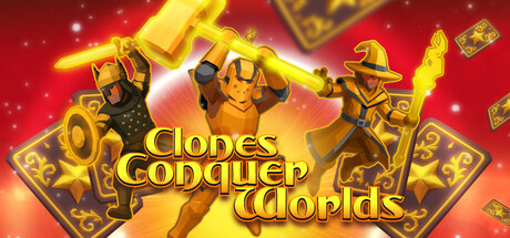
A tactical deckbuilder where you shape and command customizable clone squads. Equip them with weapons, armor, and light or dark powers. Mix their traits and tactical positioning to create deadly synergies — and conquer alien worlds!
$2.99
StrategyTacticalDeckbuilding
NeedCrit GamesNov 30, 2025