Quick text summary
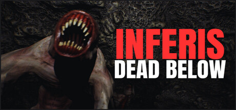
Inferis: Dead Below scored 70/100 on Steam Analyzer — Good for a Indie capsule. Top priority fix: [genre_clarity] Add a subtle visual cue that signals investigation or narrative adventure—consider a faint tool silhouette, journal element, or human figure in the background to establish journalist protagonist context and differentiate from pure creature-horror.
Capsule scores by dimension
- Genre Clarity: 7/10 — Horror adventure evident but genre niche unclear. The grotesque creature with exposed teeth and red-orange glow immediately signals horror, and the dark subterranean setting reinforces dungeon-exploration atmosphere. However, at tiny size the creature silhouette reads as abstract horror rather than specifically communicating 'adventure-horror' or the journalism/investigative angle—it could belong to pure survival horror or creature-focused content instead. The creature is the primary hook, but doesn't uniquely position this as a narrative-driven journalistic descent.
- Title Readability: 8/10 — Strong contrast title legible at all sizes. The title is divided across two lines with 'INFERIS' in bright red and 'DEAD BELOW' in white, both set against a dark background with no competing texture in that region. The bold sans-serif holds legibility even at tiny size due to high value contrast and clean letter spacing. The tagline placement is clear and does not collapse, making it one of the capsule's strongest elements across all viewing conditions.
- Contrast & Color: 8/10 — Excellent separation via red-orange glow. The creature's bioluminescent mouth area (red-orange tones) creates strong warm-against-cool contrast against the dark blue-black cave texture and Steam background. The red title pops significantly against the background, and the white 'DEAD BELOW' ensures secondary readability. In grayscale, the mouth cavity and creature silhouette remain distinct from the murky rock backdrop, though the creature's body blends slightly into shadow—the glowing mouth compensates and keeps focal point readable at all sizes.
- Uniqueness & Polish: 6/10 — Competent creature horror but familiar execution. The creature design is effective and unsettling, with a memorable gaping-mouth silhouette that feels polished and intentional rather than asset-generated. However, the overall composition (creepy creature + title overlay + dark background) follows a standard indie horror capsule template seen in similar titles—there is no distinctive visual signature, mechanic hint, or storytelling element that separates this from other creature-focused horror games. The execution is clean but the concept is archetypal.
- Brand Consistency: 6/10 — Minimal internal cues, no memorable identity signal. The capsule shows a single creature design and color palette (reds, blacks, grays) with no repeated motifs, iconic symbols, or signature typography visible that would carry across other marketing materials. Without access to secondary store assets, the capsule alone provides no distinctive brand hook—the creature could theoretically represent any underground horror game. Consistency is assumed to exist in the full game context, but the capsule itself does not establish a memorable visual identity cue.
- Composition: 7/10 — Clear focal point with solid hierarchy. The creature occupies left-center space with a strong silhouette that draws immediate attention, while the title anchors the right side in a balanced but non-competing placement. The composition avoids clutter and dead space, with the creature and text working as distinct zones. At tiny size the eye reads creature first, then title—hierarchy is clear. The left-edge positioning of the creature is slightly risky for Steam cropping but the gaping mouth is far enough from the edge to survive typical margin reductions.
What works
- Title contrast and legibility. Red and white typography against dark background maintains excellent readability from full size down to tiny thumbnail, with clean sans-serif letterforms and no competing texture interference.
- Creature silhouette appeal. The grotesque mouth design creates an immediately unsettling focal point that communicates horror intent and stands out distinctly even at compressed sizes.
- Color separation and polish. The warm glow of the creature's bioluminescent mouth creates excellent contrast against cool dark tones, and rendering quality appears intentional and well-crafted rather than generic asset-based.
What hurts the capsule
- Generic horror template execution. The capsule follows a familiar 'creepy creature + title' formula without a distinctive visual hook that differentiates it from other indie horror games or communicates the journalism-investigation angle.
- Limited brand identity signals. No repeated motifs, iconic symbols, or signature color palette elements visible that would make this design recognizable as 'Inferis' specifically rather than a generic creature-horror title.
- Genre niche clarity gap. The horror is clear but the 'adventure' and 'narrative investigation' angles are not visually suggested—nothing hints at the journalist protagonist or puzzle-exploration core beyond 'dark underground creature.'
Priority fixes
- [genre_clarity] Add a subtle visual cue that signals investigation or narrative adventure—consider a faint tool silhouette, journal element, or human figure in the background to establish journalist protagonist context and differentiate from pure creature-horror.
- [uniqueness_polish] Introduce a signature visual motif or distinctive color accent that could become a recognizable brand element across marketing materials—perhaps a unique glyph, symbol, or consistent secondary color that feels proprietary to Inferis.
- [brand_consistency] Verify the creature design and color palette consistency across all store screenshots and promotional materials to ensure a cohesive and memorable visual identity beyond this single capsule.
Store copy priority fixes
- [feature_communication] Rewrite the Game Features section to include specific player actions and mechanics—e.g., 'Uncover clues through environmental exploration and audio logs' or 'Make moral or narrative choices that shape your descent' to clarify what 'walking simulator' entails.
- [uniqueness] Add a sentence to the Story Overview that hints at a distinctive narrative element or supernatural mechanic unique to Inferis—e.g., 'a specific revelation,' 'a recurring entity,' or 'a non-linear reality mechanic' that competitors lack.
- [hook_strength] Strengthen the short description by replacing 'only terror' with a more specific sensory or emotional detail—e.g., 'You descend expecting rescue... instead, the tunnels whisper your secrets back to you.'
Related guides
Steam app ID: 3919230 · Tags: Indie, Gore, Horror, Psychological Horror, First-Person