Scoring genre clarity...
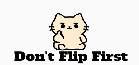
This is a reflex game where a fat cartoon cat flips you off, and you have to flip back at the same time. That's it. That's the game. This IS the greatest game you'll ever play in your entire life. Probably. You won't regret spending $1.
$0.991 user reviews
ActionAdventureCasual
LionsHead DevelopmentAug 20, 2025