Scoring genre clarity...

Childhood Watermelon capsule

Childhood Watermelon

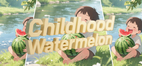
This is a casual puzzle game, where the position of each game image is random and can be repeated.At first, it may be very chaotic,Then gradually place the image in the corresponding position,The image gradually becomes complete,Come and give it a try!

$29.99No user reviews
Casual2D Fighter2D Platformer
hgmGameAug 17, 2025

Childhood Watermelon scores 72/100 — better than 43% of Casual capsules (n=10,153).

No user reviews · $29.99 · Released Aug 17, 2025 · By hgmGame

Quick text summary

Childhood Watermelon scored 72/100 on Steam Analyzer — Good for a Casual capsule. Top priority fix: [contrast_color] Increase saturation or value contrast in the title treatment—consider a brighter gold or cream with a thin dark outline to enhance legibility at tiny size and pop against the Steam dark background.

Capsule scores by dimension

  • Genre Clarity: 7/10 — Casual puzzle game clearly signaled. The cheerful children, watermelons, and pastoral riverside setting immediately communicate a wholesome casual experience. The bright, playful art style and lack of combat or complex UI elements signal puzzle or collection mechanics. At tiny size, the watermelon and child imagery remain recognizable and convey the casual, family-friendly tone, though the specific puzzle mechanic is not visually obvious.
  • Title Readability: 8/10 — Title readable at all sizes. The title 'Childhood Watermelon' uses a bold, cream-colored serif font with clean letterforms and adequate spacing. Text placement is centered over a mid-value background with watermelon and landscape elements providing soft contrast. At tiny size, the title remains legible despite the decorative serif styling, and the watermelon graphics flanking the text provide visual anchors that aid recognition.
  • Contrast & Color: 7/10 — Warm palette pops moderately well. The cream and gold text contrasts adequately against the blue-green river and landscape background, with warm orange-red watermelons providing color separation. In grayscale, the value separation is solid but not dramatic—the mid-tone greens and flesh tones lack the punch of pure light-dark extremes. At small size, the composition reads clearly, though the overall warm-peachy color range is somewhat muted against the Steam dark background.
  • Uniqueness & Polish: 7/10 — Cohesive illustration with light charm. The artwork demonstrates consistent, competent illustration with soft rendering, expressive character poses, and a unified hand-drawn or digital painting aesthetic. The watermelon-focused visual hook and nostalgic 'childhood' framing provide gentle thematic distinction. However, the style, while pleasant, is not dramatically distinctive in the casual game market—similar watercolor-to-illustration approaches appear in multiple indie titles, and the execution, while solid, does not stand out as exceptional polish relative to genre leaders like Balatro or Tiny Glade.
  • Brand Consistency: 6/10 — Coherent style, limited identity strength. The art direction is internally consistent with soft color grading, a unified illustration style, and thematic cohesion around childhood, nature, and watermelons. However, there are no strong signature motifs, icon systems, or memorable character silhouettes that would create immediate brand recognition. The warm, pastoral aesthetic is pleasant but does not project a distinctive identity that would be instantly recognizable in isolation or across marketing materials.
  • Composition: 8/10 — Strong focal hierarchy and balance. The layout positions the playful children at left and right with the title centered, creating a symmetrical, balanced composition that frames the core narrative. The riverside background and vegetation provide natural depth layering without cluttering the focal point. At tiny size, the composition remains readable with clear center emphasis and appropriate safe margins, though edge-positioned children rely on silhouette recognition rather than detail.

What works

  • Clear genre communication. Cheerful characters, watermelon imagery, and pastoral setting instantly convey a wholesome casual puzzle experience without ambiguity.
  • Centered title legibility. Bold serif font and centered placement with sufficient contrast maintain readability across full, small, and tiny viewing sizes.
  • Balanced composition. Symmetrical layout with children flanking title and natural depth separation create visual interest and clear focal hierarchy.

What hurts the capsule

  • Generic style in crowded market. While well-executed, the watercolor-illustration approach and pastoral aesthetic lack distinctive visual language compared to genre benchmarks like Tiny Glade or Balatro.
  • Limited brand identity. No signature character, icon system, or memorable motif creates lasting brand recall or recognition potential.
  • Muted color contrast against Steam. The warm peachy-orange palette, while cohesive, does not create dramatic pop against the dark Steam background and may appear soft during quick scrolling.

Priority fixes

  1. [contrast_color] Increase saturation or value contrast in the title treatment—consider a brighter gold or cream with a thin dark outline to enhance legibility at tiny size and pop against the Steam dark background.
  2. [uniqueness_polish] Develop a signature visual hook or character expression that differentiates this title from similar pastoral casual games—strengthen the watermelon or child character as a memorable icon.
  3. [brand_consistency] Establish and apply a consistent motif or symbol (e.g., a unique watermelon design, color accent, or character pose) that becomes recognizable as the game's visual signature.

Store copy priority fixes

  1. [hook_strength] Rewrite the short description to open with a nostalgic or playful hook: 'Rearrange scrambled puzzle pieces to complete hidden images—test your memory and spatial skills with endless randomized challenges.' This leads with action and player benefit rather than technical specs.
  2. [feature_communication] Replace the jargon-heavy mechanic explanation with conversational clarity: 'Swap adjacent tiles around an empty space to reassemble 16-piece puzzles into complete images. Each puzzle shuffles differently, so you can play the same image over and over.' This mirrors actual player actions.
  3. [tone_match] Rewrite the 'Suitable for' section to sound warm and inviting: 'Perfect for puzzle lovers seeking a relaxing brain-teaser, or anyone looking for a quick, repeatable challenge between activities.' Remove 'exercise their brainpower' corporate phrasing.
  4. [uniqueness] Add a concrete differentiator or gameplay hook: 'Unlimited randomly-shuffled puzzles' or 'Progressive difficulty as you master each image' or 'Unlock new image categories' to explain why this variant matters.

Related guides

Steam app ID: 3921130 · Tags: Casual, 2D Fighter, 2D Platformer, 2.5D, Crafting