Scoring genre clarity...

Dermapis capsule

Dermapis

In Dermapis, a point-and-click adventure set (mostly) in an apartment, you take on the role of its resident: Yvette. Meet interesting characters, solve puzzles, and make decisions that can influence the plot.

$0.99Positive(16)
ExplorationInteractive FictionPuzzle
JanneSep 10, 2025

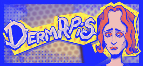
Dermapis scores 62/100 — better than 3% of Exploration capsules (n=4,872).

Positive (16 reviews) · $0.99 · Released Sep 10, 2025 · By Janne

Quick text summary

Dermapis scored 62/100 on Steam Analyzer — Solid for a Exploration capsule. Top priority fix: [contrast_color] Replace or reduce the dotted background texture with a cleaner gradient or solid to increase silhouette clarity of both title and character at small sizes.

Capsule scores by dimension

  • Genre Clarity: 5/10 — Unclear genre, character focus. The capsule emphasizes a stylized female character portrait with bold art style, but gives minimal gameplay context. At tiny size, you see a face and logo but cannot determine this is a point-and-click adventure or what the core mechanic involves. The aesthetic reads as indie character-driven, but the specific genre (adventure/puzzle) is not visually communicated through environmental or UI cues.
  • Title Readability: 7/10 — Logo clear at most sizes. The DERMAPIS title uses a bold yellow outline with strong contrast against the blue background, maintaining legibility at small and tiny sizes. At full size it reads cleanly; at tiny size the letterforms remain distinguishable despite the cartoon font. However, the decorative comic-style lettering risks losing crispness on certain compression or display conditions.
  • Contrast & Color: 7/10 — Strong primary contrast, soft midtones. The bright yellow logo and blue background create excellent separation and pop against Steam's dark background. The character portrait uses warm peachy skin tones and red/orange hair that stand out in the upper right. The tan/brown dotted texture in the background reads as mid-tone filler that slightly dulls overall punch, and the character's face—while colorful—sits on a soft-focus area that reduces silhouette crispness at tiny size.
  • Uniqueness & Polish: 6/10 — Stylized character, derivative layout. The character illustration shows clear artistic intent with expressive linework and bold color choices, giving it a distinctive indie feel. However, the composition—large character portrait on the right, text on the left—follows a common indie game capsule template seen frequently in the genre. The overall execution is competent but not visually distinctive enough to stand out among top indie titles like DREDGE or Chants of Sennaar.
  • Brand Consistency: 6/10 — Character identity present, limited cohesion. The character Yvette is the clear focal point and could become a recognizable brand symbol for the game. The bold cartoon illustration style is internally consistent within this capsule. However, without additional context of in-game visuals or UI, it is difficult to assess whether this character style and color palette align with the overall game's art direction or if the capsule stands apart from actual gameplay presentation.
  • Composition: 6/10 — Balanced layout, soft focal point. The design uses a symmetrical split with logo left and character right, creating balance but also splitting attention. The character occupies good real estate and reads clearly at full size, but at tiny size the portrait becomes a soft blob that loses detail and hierarchy. The composition avoids extreme edge-hugging and maintains safe margins, but the central dotted background texture creates visual clutter that competes with both the title and character silhouette.

What works

  • Bright, readable title logo. Yellow DERMAPIS text with outline maintains legibility from full to tiny sizes, providing clear game identification.
  • Strong value contrast against Steam background. Blue, yellow, and warm character tones all separate cleanly from the dark #1b2838 backdrop in quick scrolling context.
  • Distinctive character illustration. Yvette's expressive face and bold art style give the capsule an indie personality and potential brand icon.

What hurts the capsule

  • Genre ambiguity at small sizes. The capsule reads as character portrait but fails to communicate point-and-click adventure or puzzle gameplay through visual language.
  • Busy dotted background reduces clarity. The tan/brown textured field competes visually with both title and character, creating mid-tone clutter that softens focus.
  • Character portrait loses detail at tiny size. The soft-focus portrait collapses into an indistinct shape at thumbnail scale, reducing the distinctiveness that makes it work at full size.
  • Split composition dilutes focal hierarchy. Logo left, character right creates balance but splits attention equally rather than establishing one clear primary focal point for scanning.

Priority fixes

  1. [contrast_color] Replace or reduce the dotted background texture with a cleaner gradient or solid to increase silhouette clarity of both title and character at small sizes.
  2. [genre_clarity] Add subtle environmental or UI detail (apartment window frame, puzzle element, or inventory-style accent) to signal the point-and-click adventure genre without cluttering the composition.
  3. [composition] Increase character portrait size and move it slightly higher or add a subtle background spotlight effect to establish stronger focal hierarchy and improve tiny-size readability.
  4. [uniqueness_polish] Consider adding a distinctive motif or palette signature (e.g., art deco frame, thematic color tint) that differentiates this from generic indie character portraits and aligns with the apartment setting.

Store copy priority fixes

  1. [hook_strength] Rewrite the opening line to replace 'Meet interesting characters' with a specific, evocative detail about Yvette's situation or discovery (e.g., 'Isolated in her apartment, Yvette begins to notice disturbing inconsistencies in her everyday surroundings').
  2. [uniqueness] Add a sentence that articulates what makes this game distinct—whether it's a specific narrative twist, a unique puzzle style, or a particular atmosphere—rather than relying on generic adventure tropes.
  3. [feature_communication] Include at least one concrete example of a puzzle type or a branching decision moment to help players understand the depth of these systems.
  4. [audience_targeting] Strengthen the opening to signal whether this is a meditative exploration game or a tense psychological narrative, so the right player immediately recognizes the game is for them.

Related guides

Steam app ID: 3921590 · Tags: Exploration, Interactive Fiction, Puzzle, Point & Click, Female Protagonist