Scoring genre clarity...
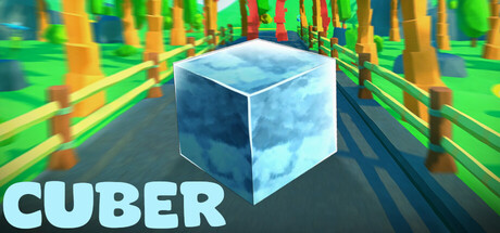
Cuber is a low-poly endless runner game in which you have to keep an ice cube alive. There are many obstacles, as well as items that influence the effect of the obstacles. So you have to make smart decisions: do you avoid obstacles, or do you try to destroy them with the help of the items?
Free to PlayMostly Positive(10)
CasualArcadeRhythm
ArbdevOct 2, 2025