Scoring genre clarity...
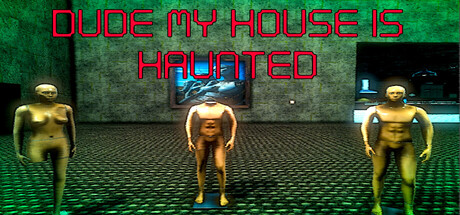
Welcome to a Haunted house full of ghostly shenanigans and spooky jump scares! You are a top G ghost hunter and you must capture all the ghostly anomalies that terrorize this luxurious home. This isn't just paranormal activity, this is paranormal BRUH-tivity.
$0.993 user reviews
CasualWalking SimulatorCollectathon
Supreme Gauntlet GamesAug 27, 2025