Scoring genre clarity...

Infestation on Epsilon 13 capsule

Infestation on Epsilon 13

Collect the data disks, avoid enemies, and go for the high score.

$0.99
ArcadeSingleplayerAction
XaybaSep 5, 2025

Infestation on Epsilon 13 scores 77/100 — better than 71% of Arcade capsules (n=3,765).

$0.99 · Released Sep 5, 2025 · By Xayba

Quick text summary

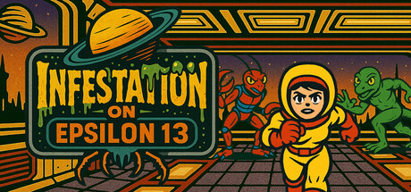
Infestation on Epsilon 13 scored 77/100 on Steam Analyzer — Good for a Arcade capsule. Top priority fix: [genre_clarity] Add subtle visual indicator of the collection mechanic (glowing data disk or collection UI element) to clarify the gather-and-dodge gameplay loop.

Capsule scores by dimension

  • Genre Clarity: 7/10 — Space action arcade clearly signaled. The sci-fi setting is immediately obvious through the space helmet, alien enemies, planetary backdrop, and retro arcade aesthetic. At TINY size, the helmet-wearing protagonist and green alien silhouettes still read as space action, though the specific 'collect and avoid' mechanic is not visually evident. Genre expectations align with casual arcade gameplay through the bold, simple character designs and energetic composition.
  • Title Readability: 8/10 — Bold title excellent legibility. The yellow and orange title 'INFESTATION ON EPSILON 13' uses thick, condensed letterforms with strong black outlines positioned on a dark semi-transparent background band at center-left. At SMALL and TINY sizes, the letters remain clearly readable due to high contrast and generous weight. The subtitle positioning below the main logo ensures no text overlap and maintains clarity across all viewing conditions.
  • Contrast & Color: 8/10 — Vibrant warm palette strong separation. Gold, orange, and yellow tones create excellent value separation against the dark purple-gray background and dark blue accents. The yellow-suited protagonist pops clearly even at TINY size due to saturated warm colors against cool backgrounds. Grayscale test confirms strong light-dark hierarchy—the title band, character suit, and planetary rings all maintain distinct silhouettes without muddy mid-tones.
  • Uniqueness & Polish: 8/10 — Distinctive retro vector art style. The vector-based comic art style with bold outlines, geometric shapes, and intentional color blocking feels premium and cohesive, avoiding generic 3D rendered scenes. Character designs are memorable and quirky—the round-bodied astronaut and colorful alien creatures have personality that communicates fun casual gameplay. Craft is evident in the layered background detail (floor tiles, planet rings, decorative geometry), which elevates it beyond template-based capsules.
  • Brand Consistency: 7/10 — Strong internal style, limited history. The capsule demonstrates exceptional internal consistency—the vector art style, color palette (yellow/orange/teal), geometric UI treatment, and character design language all reinforce a cohesive identity. Without access to other game materials, brand uniqueness cannot be fully assessed, but the bold comic aesthetic and specific visual choices (helmet design, alien shapes, title treatment) would likely be recognizable across multiple touchpoints. The style feels distinctive within the indie casual space rather than derivative.
  • Composition: 8/10 — Clear hierarchy excellent focal balance. The yellow-suited protagonist anchors the right side as primary focal point, while the large title logotype dominates the left-center with complementary visual weight. Character and enemies create natural left-to-right reading flow with foreground action figures, mid-ground title treatment, and background planetary detail. At SMALL and TINY sizes, the composition holds strong with no elements bleeding into edges or competing equally for attention—the astronaut and title remain clearly separated and readable.

What works

  • Bold readable typography. Yellow and orange title with black outlines maintains perfect legibility from full size down to tiny thumbnails without any loss of clarity.
  • Distinctive visual identity. Vector art style with geometric design language and quirky character aesthetics feel premium and memorable, differentiating it from generic indie releases.
  • Strong value contrast. Warm color palette pops dramatically against the dark Steam background, with excellent grayscale separation ensuring visibility during quick scrolls.
  • Effective focal point hierarchy. The yellow protagonist and left-aligned title create clear visual anchors that guide the eye without competing for equal attention at any viewing size.

What hurts the capsule

  • Gameplay mechanics not visually communicated. The 'collect data disks, avoid enemies, high score' core loop is not clearly conveyed through visual iconography—appears primarily as combat action rather than collection-dodge gameplay.
  • Dense background elements compete at tiny size. Floor tiles, decorative geometry, and background details create visual noise that slightly reduces clarity of the primary character at TINY viewing conditions, though not critically.
  • Limited narrative context. The capsule does not clearly establish what makes Epsilon 13 unique or why this specific location matters, reducing emotional investment in the premise.

Priority fixes

  1. [genre_clarity] Add subtle visual indicator of the collection mechanic (glowing data disk or collection UI element) to clarify the gather-and-dodge gameplay loop.
  2. [composition] Reduce background tile density or increase opacity of the semi-transparent title band to further improve character silhouette clarity at TINY size.
  3. [uniqueness_polish] Consider adding a signature brand motif or recurring symbol that could anchor Epsilon 13's identity across future marketing materials and store screenshots.

Store copy priority fixes

  1. [feature_communication] Expand the vertical bonus round bullet to explain the mechanic: 'After each wave, enter a vertical-scrolling bonus round to collect extra points—a risk/reward opportunity to boost your score before the next challenge.' This elevates the game's pacing variety.
  2. [uniqueness] Add 1-2 sentences articulating what sets this game apart: 'Unlike traditional maze games, [specific mechanic or design choice] creates [unique outcome].' Currently the game reads as a faithful homage without a clear reason to choose it.
  3. [hook_strength] Rewrite the short description to lead with emotional or curiosity hook: Replace 'Collect the data disks, avoid enemies, and go for the high score' with something like 'Escape the alien-infested Epsilon 13 station in this retro arcade survivor—outmaneuver alien patrols and hunt for research data to survive.' This adds urgency and character.
  4. [feature_communication] Add a 2-3 sentence paragraph explaining progression: clarify how the difficulty escalates, how lives and bonus unlocks work together, and what progression looks like across multiple waves to help players understand the game's pacing arc.

Related guides

Steam app ID: 3925540 · Tags: Arcade, Singleplayer, Action, Sci-fi, 2D