Scoring genre clarity...

GOLOD capsule

GOLOD

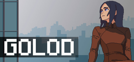
GOLOD is an atmospheric visual novel about survival in the pixel-art style, where you will have to fight not only with a lack of food, but also with panic, suffocating idleness, secrets of the past, betrayal and difficult moral choices in a confined space.

$1.995 user reviews
AnimeVisual NovelPixel Graphics
116 BoysSep 25, 2025

GOLOD scores 68/100 — better than 28% of Anime capsules (n=1,515).

5 user reviews · $1.99 · Released Sep 25, 2025 · By 116 Boys

Quick text summary

GOLOD scored 68/100 on Steam Analyzer — Solid for a Anime capsule. Top priority fix: [uniqueness_polish] Introduce a visual hook that hints at the core mechanic—such as food scarcity imagery, a confined space visual, or a symbolic object—rather than a generic character-plus-cityscape formula.

Capsule scores by dimension

  • Genre Clarity: 7/10 — Atmospheric indie adventure readable. The pixel-art character in brown clothing against a moody cityscape clearly signals indie/narrative-driven adventure rather than action or puzzle genres. At TINY size, the urban dystopian setting and character silhouette are legible enough to convey a survival or story-focused game, though the specific mood of isolation and moral choice doesn't read without context. The visual style choices support atmospheric indie positioning.
  • Title Readability: 8/10 — Bold sans-serif title clear. GOLOD is rendered in a strong, thick white sans-serif typeface with high contrast against the gray background and supporting dark horizontal bar. The title maintains full legibility at SMALL and TINY sizes due to generous letter spacing and weight. At TINY size there is no ambiguity in letter recognition, making it one of the stronger elements of this capsule.
  • Contrast & Color: 7/10 — Solid value separation works. The white title pops strongly against the gray and blue tones, and the character's warm brown outfit creates clear silhouette separation from the cool cityscape background. In grayscale mental test, the light character form reads distinctly from the mid-to-dark background layers. At TINY size the value structure holds, though the character detail begins to flatten slightly.
  • Uniqueness & Polish: 6/10 — Competent but visually restrained. The pixel-art character illustration is clean and well-rendered with consistent shading and recognizable proportions, but the composition relies heavily on genre-standard elements: lone figure, urban backdrop, muted palette. While the mood is cohesive, it does not communicate a distinctive mechanical hook or memorable visual storytelling moment that separates it from other indie adventure capsules. The craftsmanship is solid but the concept feels familiar within the visual novel and survival narrative space.
  • Brand Consistency: 6/10 — Minimal internal identity cues. The capsule shows a consistent muted color palette (browns, grays, cool blues) and pixel-art style that should align with store screenshots, but lacks a distinctive motif, iconic symbol, or recognizable brand marker beyond the character design itself. There are no visible logo elements, recurring visual patterns, or signature design choices that would make this capsule immediately recognizable as GOLOD in a crowded list. The internal cohesion is present but not memorable.
  • Composition: 7/10 — Clear hierarchy with good balance. The character is positioned right of center as the primary focal point, the title anchors bottom-left with the dark bar providing a ground plane, and the cityscape fills upper space with natural depth layering. The composition avoids dead center clutter and uses safe margins well for Steam cropping. At TINY size the focal point remains clear, though the character loses some detail definition.

What works

  • Title legibility at all sizes. GOLOD's bold white sans-serif never collapses or becomes muddy, maintaining perfect readability from FULL down to TINY scale.
  • Effective value contrast. The white title and warm character silhouette separate cleanly from the cool gray-blue background, creating strong visual punch against #1b2838.
  • Well-structured composition. Clear focal hierarchy with character as primary subject, title as anchor, and cityscape as supporting depth layer guides the eye naturally without clutter.

What hurts the capsule

  • Generic visual premise. The lone-figure-in-dystopian-city composition is a well-worn trope in indie adventure marketing and does not communicate the specific survival/moral choice mechanic of GOLOD.
  • Weak brand identity signals. No iconic symbol, recurring motif, or signature visual element that would make this capsule instantly recognizable as GOLOD versus other indie survival titles.
  • Limited storytelling specificity. The capsule does not visually hint at the confinement, panic, betrayal, or food scarcity themes that are core to the narrative experience described.

Priority fixes

  1. [uniqueness_polish] Introduce a visual hook that hints at the core mechanic—such as food scarcity imagery, a confined space visual, or a symbolic object—rather than a generic character-plus-cityscape formula.
  2. [brand_consistency] Add a recognizable icon, motif, or title treatment (logo lock-up) that becomes a signature visual marker for GOLOD across future marketing.
  3. [genre_clarity] Subtly reinforce the moral choice and isolation themes through environmental detail (bars on windows, empty spaces, warning signs) to differentiate from generic survival games.

Store copy priority fixes

  1. [hook_strength] Rewrite the short description to open with the core moral dilemma—e.g., 'Locked in a skyscraper with strangers, dwindling food, and unknown horrors, every choice risks betrayal or survival at any cost—' before naming the visual novel format.
  2. [uniqueness] Add a specific, concrete differentiator in the detailed description—e.g., explain how GOLOD's alternate-history setting or mystery structure diverges from standard survival VNs, or highlight a narrative mechanic unique to this title.
  3. [feature_communication] Move the QTE-events mention into a brief, clearly-signaled gameplay section or remove it if it is peripheral—the current placement creates mechanical confusion in what reads as a choice-driven narrative experience.
  4. [genre_clarity] Briefly clarify the gameplay loop in one sentence early in the detailed description—e.g., 'Manage resources, navigate moral crises, and uncover dark secrets through branching choices that reshape the story' to anchor the visual novel mechanics.

Related guides

Steam app ID: 3928080 · Tags: Anime, Visual Novel, Pixel Graphics, Adventure, Horror