Moon Garden Optimizer scores 65/100 — better than 10% of Strategy capsules (n=5,103).

Quick text summary

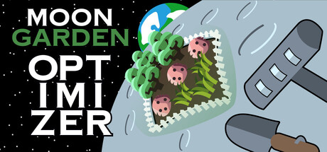
Moon Garden Optimizer scored 65/100 on Steam Analyzer — Solid for a Strategy capsule. Top priority fix: [title_readability] Consolidate the title onto two clear lines and avoid splitting words; consider 'MOON GARDEN' on line 1 and 'OPTIMIZER' on line 2 with consistent sizing to improve tiny-size legibility.

Capsule scores by dimension

  • Genre Clarity: 7/10 — Garden strategy puzzle game clear. The isometric garden bed with green plants and pink flowers immediately signals a cultivation/gardening theme, and the puzzle-like layout suggests strategy gameplay. At tiny size, the plant arrangement and watering can are readable enough to convey a garden management mechanic, though the exact genre nuance (deck-builder without a deck) isn't visually apparent from visuals alone.
  • Title Readability: 6/10 — Title readable but awkward spacing. The title 'MOON GARDEN OPTIMIZER' is split across four lines with mixed typography—'MOON' and 'OPTIMIZER' in white, 'GARDEN' in green, and 'OPT IMI TIZER' breaking awkwardly. At full size it's readable, but at tiny size the line breaks and variable sizing cause the layout to feel cramped and slightly confusing; the word split on 'OPTIMIZER' particularly hurts legibility.
  • Contrast & Color: 7/10 — Strong isometric garden pops nicely. The pale blue-gray background creates good separation from the vibrant green plants and pink flowers in the garden, with the white text and dark watering can providing clean contrast against the dark starfield on the left. The color palette works well against the Steam dark background, though the starfield uses black which doesn't help separation from the canvas edge.
  • Uniqueness & Polish: 7/10 — Charming aesthetic with cohesive style. The isometric illustration style is clean and intentional, with a distinctive art direction that feels hand-crafted rather than generic. The watering can and garden layout communicate the core water-conservation mechanic clearly, and the playful color choices convey a casual, accessible tone that stands out from typical puzzle game visuals.
  • Brand Consistency: 6/10 — Consistent art style lacks signature motif. The isometric illustration maintains a coherent rendering style and palette across the visible elements, with consistent line weight and color harmony between the garden, plants, and tools. However, there is no iconic character, recurring symbol, or signature brand mark that creates a memorable identity cue for future recognition; the visuals feel thematically consistent but not distinctively branded.
  • Composition: 6/10 — Unclear hierarchy with competing elements. The garden bed is positioned center-right, but the title dominates the left half with uneven line lengths that create visual imbalance; the watering can and satellite in the top-right corner feel secondary but still claim attention. At small and tiny sizes, the split focus between text and garden illustration makes it harder to lock onto a single focal point, and the title's awkward layout fragments the read.

What works

  • Vibrant garden illustration. The isometric garden with green foliage and pink flowers is visually appealing and immediately communicates the gardening theme with charm and personality.
  • Strong color contrast against dark background. The pale background, bright greens, and pink accents create excellent separation from the Steam dark UI, helping the capsule stand out in the storefront.
  • Cohesive visual style. The illustration maintains consistent line weight, rendering quality, and aesthetic across all elements, conveying a polished indie game feel.

What hurts the capsule

  • Awkward title line breaks. The word 'OPTIMIZER' is split across two lines as 'OPT IMI TIZER,' creating confusion and reducing readability at small sizes where the separation becomes hard to parse.
  • Competing focal points. The large fragmented title on the left and the detailed garden illustration in the center-right create unclear hierarchy, making it difficult to identify the primary subject at thumbnail size.
  • No memorable brand mark. The capsule lacks a distinctive icon, character, or recurring motif that would make the game recognizable on its own; the visuals are thematically sound but not uniquely branded.
  • Uneven title composition. The four-line title with varying line lengths and mixed coloring feels unbalanced against the garden illustration, creating visual tension rather than harmony.

Priority fixes

  1. [title_readability] Consolidate the title onto two clear lines and avoid splitting words; consider 'MOON GARDEN' on line 1 and 'OPTIMIZER' on line 2 with consistent sizing to improve tiny-size legibility.
  2. [composition] Rebalance the layout so the garden illustration becomes the clear primary focal point with the title as supporting text; reduce title size or position it to the bottom or top edge to increase visual hierarchy.
  3. [brand_consistency] Add a subtle iconic element such as a recurring symbol, color accent, or character silhouette that can serve as a recognizable brand mark across all marketing materials.
  4. [contrast_color] Ensure the black starfield has a subtle outline or lighter tone to separate it more clearly from the canvas edge and improve the overall silhouette at tiny sizes.

Store copy priority fixes

  1. [hook_strength] Rewrite the short description opening to lead with the core action (e.g., "Cultivate lunar plants under water constraints") before labeling the genre, and save the personality clause about the undo button and perfectionism as a strong closer.
  2. [feature_communication] Expand on water conservation mechanics: clarify what water does (resource cost per plant type?), what happens when you exhaust it, and how it creates strategic tension alongside the deckbuilding puzzle.
  3. [uniqueness] Reinforce the unique selling point in the short description itself—mention that this combines deckbuilding strategy with zero randomness, not just in the detailed description's Dominion comparison.

Related guides

  • Steam page optimisationCapsule, copy, screenshots, tags — the full Steam page conversion stack.
  • Steam tags guideTag selection, ordering, and how it shapes Steam's recommendation rails.

Steam app ID: 3931930 · Tags: Strategy, Puzzle, Sokoban, Casual, Score Attack