Scoring genre clarity...
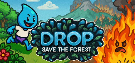
In Drop: Save the Forest, use the power of water to solve environmental puzzles, extinguish wildfires, and save biomes inspired by the Dolomites. 🏔️ Combine elements like wind, fire, and plants in a lively pixel art adventure. 💧🌱🔥
HK$ 33.00Positive(11)
PuzzleActionPixel Graphics
Riccardo Giol, Games Greenhouse5 Dec, 2025