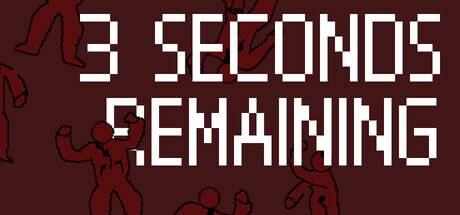
Quick text summary
3 SECONDS REMAINING scored 70/100 on Steam Analyzer — Good for a Top-Down Shooter capsule. Top priority fix: [uniqueness_polish] Add a distinctive visual element or icon that represents the core mechanic (e.g., a timer visual, weapon silhouette, or unique character design) to increase memorability and differentiation.
Capsule scores by dimension
- Genre Clarity: 7/10 — Action game with urgency cues. The pixelated stick figures in dynamic poses and the bold industrial typography suggest fast-paced action gameplay. At TINY size, the urgency conveyed by the title and simplified character silhouettes reads as action-oriented, though the top-down shooter specificity is not immediately obvious without prior knowledge. The red and dark brown palette reinforces an intense, aggressive tone.
- Title Readability: 8/10 — Strong geometric sans-serif legibility. The large, clean pixelated block font reads clearly at all sizes with excellent contrast against the dark background. At TINY size, the title remains highly legible due to its bold weight and wide letterform spacing. The title placement dominates the composition without being cramped, and the geometric nature of the typeface ensures no letterforms collapse when scaled down.
- Contrast & Color: 8/10 — High-contrast white on deep maroon. The bright white title pops distinctly against the deep burgundy/maroon background with strong value separation that survives the Steam dark background. The red stick figure outlines provide secondary contrast without competing, and the overall palette reads cleanly in grayscale with excellent silhouette clarity. At TINY size, the contrast holds and elements remain visually separated.
- Uniqueness & Polish: 6/10 — Minimal but coherent retro aesthetic. The pixelated typography and stick figure art create a deliberate indie retro style that feels intentional rather than generic. However, the execution is quite sparse—minimal visual storytelling beyond the title and basic character poses, lacking a distinctive hook or memorable visual element that distinguishes it from other minimalist action games. The craft is clean but the concept feels familiar without a standout unique selling point.
- Brand Consistency: 6/10 — Consistent retro pixel identity. The minimalist pixel art style and geometric sans-serif font create internal cohesion across the capsule. Without reference to the five store screenshots, it is difficult to assess whether this establishes a recognizable brand identity beyond the aesthetic choice of pixelated retro visuals. The color palette and typography are consistent within this image, but lack a distinctive icon, character, or motif that would aid later recognition.
- Composition: 7/10 — Clear title hierarchy with balanced layout. The large centered title commands the primary focal point with decorative stick figures positioned in the margins and background, creating visual interest without clutter. At SMALL and TINY sizes, the composition remains readable with the title in clear dominance and figure details fading to texture. The layout respects safe margins and avoids cropping issues, though the empty space at the top could be tighter.
What works
- Excellent title contrast and legibility. The white geometric typeface maintains crisp readability at all scales against the deep maroon background, with no letterform collapse at tiny sizes.
- Coherent minimalist art direction. The pixelated stick figures and geometric typography feel intentional and unified, creating a consistent aesthetic that reads as polished indie craft.
- Strong urgency and tone communication. The title '3 SECONDS REMAINING' paired with dynamic figure poses immediately conveys action and pressure without requiring genre knowledge.
What hurts the capsule
- Generic visual identity without distinctive hook. Beyond the retro aesthetic choice, there is no memorable character, symbol, or unique visual concept that differentiates this from other minimalist action games.
- Limited visual storytelling and gameplay hints. The capsule does not communicate what makes the game mechanically unique or why the '3 seconds' premise is compelling beyond the literal title.
- Sparse composition with unused space. The upper-middle area of the capsule contains dead space that could be better utilized to add visual depth or reinforce the game's core mechanic.
Priority fixes
- [uniqueness_polish] Add a distinctive visual element or icon that represents the core mechanic (e.g., a timer visual, weapon silhouette, or unique character design) to increase memorability and differentiation.
- [brand_consistency] Introduce a recognizable recurring symbol or color accent that ties to the game's identity beyond generic retro styling, enabling players to remember the brand on repeat exposure.
- [composition] Redistribute stick figures or add complementary visual elements throughout the composition to reduce dead space and create visual layers that enhance the sense of chaos or urgency.
Store copy priority fixes
- [hook_strength] Rewrite the short description to lead with the 3-second timer mechanic: 'A pure and simple top-down shooter with one rule — you have only 3 seconds to eliminate an enemy or the run ends.'
- [audience_targeting] Add a single sentence indicating difficulty and player type, such as: 'Designed for players seeking intense, arcade-style action and high-pressure decision-making.'
- [feature_communication] Clarify the run structure by specifying how many floors exist or whether progression is endless, and briefly describe enemy variety.
Related guides
Steam app ID: 3933980 · Tags: Top-Down Shooter, Action, Shooter, 2D, PvE