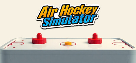
Air Hockey Simulator scores 82/100 — better than 94% of Early Access capsules (n=3,067).

Quick text summary

Air Hockey Simulator scored 82/100 on Steam Analyzer — Good for a Early Access capsule. Top priority fix: [uniqueness_polish] Add a subtle motion cue such as puck trajectory lines or slight mallet blur to convey the speed and reflexes core mechanic mentioned in the game description.

Capsule scores by dimension

  • Genre Clarity: 9/10 — Clear sports simulation identity. The air hockey table with red mallets, puck, and court markings instantly communicates the sport and genre at all sizes. The physical 3D rendering of an actual air hockey table is unambiguous gameplay imagery that leaves no doubt about what this game is. Even at tiny size, the distinctive red mallets and centered puck silhouette are instantly recognizable as air hockey equipment.
  • Title Readability: 9/10 — Bold, legible, well-positioned. The title 'Air Hockey Simulator' uses a strong yellow-orange outline with blue italic fill, positioned at the top center with clear separation from the game image below. The letterforms remain crisp and readable at small and tiny sizes due to high contrast outline work and strategic spacing. No tagline clutter or decorative collapse issues—straightforward and professional execution.
  • Contrast & Color: 8/10 — Strong separation from background. The light gray air hockey table sits on a neutral beige background with excellent value separation, and the bright red mallets and yellow puck create strong focal points that pop cleanly. The blue title text adds additional contrast layer without competing. At tiny size, the red elements and white table surface maintain clear silhouettes against the dark Steam background.
  • Uniqueness & Polish: 8/10 — Premium 3D asset with polish. The photorealistic 3D rendering of a professional air hockey table conveys high production quality and intentional craft rather than generic stock imagery. The centered composition with balanced mallets and visible court details shows attention to authenticity and visual storytelling of the core mechanic. This stands apart from lower-effort simulator capsules through clean 3D asset quality and professional photography-like presentation.
  • Brand Consistency: 7/10 — Cohesive but minimal identity. The bright yellow and blue color scheme is applied consistently across title and reinforced by the red/yellow game elements, creating a recognizable palette. However, the brand identity relies primarily on the genre itself (the table) rather than unique character, icon, or signature visual motif that would make it distinctly memorable versus other simulator titles. The presentation is clean and consistent internally but lacks a distinctive identity hook.
  • Composition: 8/10 — Balanced hierarchy, clear focal point. The composition uses a top-third title placement with ample breathing room above the centered air hockey table, creating strong vertical hierarchy and safe margins on all sides. The table is perfectly centered with symmetric mallets and puck, establishing an immediate focal point that remains legible at small sizes. No elements crowd edges, and the negative space supports rather than distracts from the primary subject.

What works

  • Instantly recognizable gameplay image. The 3D air hockey table with distinct red mallets and puck clearly communicates the sport and genre at all viewing sizes without ambiguity.
  • Professional title typography. Yellow-orange outline with blue italic fill maintains perfect readability at tiny size while conveying energy and sport identity.
  • High production asset quality. The photorealistic 3D rendering of the air hockey table signals premium craft and intentional asset selection over generic placeholder imagery.
  • Safe composition with strong margins. Title and game image are well-separated with balanced negative space, protecting critical elements from Steam cropping on all sides.

What hurts the capsule

  • Minimal brand identity differentiation. The capsule relies entirely on the genre's visual language without developing a unique character, icon, or signature motif that distinguishes it from other simulators.
  • No gameplay action or movement implied. The static table and centered mallets show the game setting but lack dynamic energy cues like motion blur, puck movement, or player feedback that convey speed and reflexes mentioned in the description.

Priority fixes

  1. [uniqueness_polish] Add a subtle motion cue such as puck trajectory lines or slight mallet blur to convey the speed and reflexes core mechanic mentioned in the game description.
  2. [brand_consistency] Develop a signature visual element—such as a stylized mascot, icon, or unique court marking—that creates a memorable identity beyond generic air hockey imagery.

Store copy priority fixes

  1. [uniqueness] Add one sentence explaining what makes this air hockey game mechanically or visually distinct—e.g., 'Dynamic AI opponents learn your playstyle' or 'Hyper-realistic physics based on real-world air hockey table mechanics.'
  2. [feature_communication] Expand the Crazy Match and Tournament descriptions with one concrete example—e.g., 'Crazy Match introduces shrinking goals and speed-boosting zones' or 'Tournament mode pits you against AI with evolving difficulty.'
  3. [audience_targeting] Add explicit audience signal—e.g., 'Perfect for quick competitive sessions solo or as a fun arcade pick-up-and-play experience' to clarify intended play session length and social context.
  4. [hook_strength] Replace 'clash of reflexes and precision' in the short description with a specific gameplay mechanic or hook—e.g., 'Every match pushes your reflexes to the limit with AI that adapts to your strategy.'

Related guides

Steam app ID: 3936960 · Tags: Early Access, Sports, Simulation, Hockey, Arcade